VAID: Indexing View Designs in Visual Analytics System
Abstract.
Visual analytics (VA) systems have been widely used in various application domains. However, VA systems are complex in design, which imposes a serious problem: although the academic community constantly designs and implements new designs, the designs are difficult to query, understand, and refer to by subsequent designers. To mark a major step forward in tackling this problem, we index VA designs in an expressive and accessible way, transforming the designs into a structured format. We first conducted a workshop study with VA designers to learn user requirements for understanding and retrieving professional designs in VA systems. Thereafter, we came up with an index structure VAID to describe advanced and composited visualization designs with comprehensive labels about their analytical tasks and visual designs. The usefulness of VAID was validated through user studies. Our work opens new perspectives for enhancing the accessibility and reusability of professional visualization designs.
1. Introduction
Visual analytics (VA) combines data mining and visualization techniques to help users with data exploration in different domains, such as biology (Krueger et al., 2020; Lekschas et al., 2018), sports (Stein et al., 2018; Cao et al., 2021), urban (Deng et al., 2023b; Lu et al., 2023), and explainable AI (Gou et al., 2021; Ono et al., 2021). Researchers in VA have developed advanced VA systems with highly customized visualization designs for obtaining insight into data (Sacha et al., 2014). Designing effective VA systems is highly challenging and demanding, requiring close collaboration between experienced visualization practitioners and domain experts.
Views are basic building blocks of VA systems. To create an effective VA system, it is critical to design views by mapping the data and tasks derived from domain problems to visual designs (Munzner, 2009). Recent advance in visualization has attempted to automate such a mapping process (Srinivasan et al., 2018; Deng et al., 2022; Chen et al., 2021b). However, these studies recommend basic statistical charts (e.g., bar and line charts) for low-level analytical tasks such as finding distributions. They can hardly support designing views in VA systems that deal with complex datasets and tasks (Keim et al., 2008a). The existing VA design pipeline heavily relies on researchers’ experience, requiring surveying related studies and summarizing design requirements for new scenarios. Passing examples can offer valuable inspiration due to the multitude of design styles in existence (Lee et al., 2010; Herring et al., 2009; Bigelow et al., 2014). To better support the designers and researchers of visual analytics, inspired by research in creativity support (Shneiderman, 2002), we believe it is important to facilitate the ideation process by enabling the exploration of previous VA view design. However, without an effective indexing method, currently, these view designs can only be searched through simple keywords, such as domain problems, which cannot fulfill the requirements of VA designers. Unable to search with more fine-grained requirements, they struggle to draw inspiration from a large number of prior successful designs.
To address the challenge, we aim to propose an indexing approach for view designs in VA systems collectively considering tasks, data, and visualizations (Munzner, 2009). However, it is unclear how to define an index structure based on these factors. For example, from the visualization perspective, a VA design might contain a hybrid use of different visual elements, such as composite visualizations (Javed and Elmqvist, 2012) and glyphs (Borgo et al., 2013). When representing these complex designs with indexes, preserving all details can lead to difficulties for designers in specifying their searching criteria and understanding their structure and semantic meanings. On the other hand, if the information is over-abstracted to a high-level description, such as a few keywords, designers may struggle to accurately express their design when searching for required design information from indexes of returned visual designs. It is important to balance expressiveness and efficiency when designing the index structure. Therefore, to understand designers’ requirements on the index structure, we conducted a workshop study with 12 VA designers, most of whom have published papers in the IEEE VAST conference as the first author. With the study, we validated the necessity of indexing past designs for creating new ones and collected the requirements for constructing such an index.
Based on the user feedback from the workshop study, we formulated an index structure named VAID for VA designs inspired by Vega-Lite (Satyanarayan et al., 2017). VAID enables an expressive characterization of visualizations with analytical tasks and visual designs. To ensure the coverage and comprehensiveness of the index, we iteratively labeled the view designs and refined the keys and values of the index structure. As a result, we gained 442 view designs from 124 VA systems and formed an informative index structure for them. To demonstrate the usefulness of VAID, we conducted a user study using a prototype for the exploration of VAID with 12 participants. Specifically, we asked participants to query designs for specific analytical tasks, data types, mark types, etc. User feedback showed that VAID could help them query diverse and useful visual designs, thereby aiding their design exploration. Leveraging the usefulness of VAID in presenting view designs, we proceeded to conduct an in-depth analysis and obtained findings into the patterns of VA view designs. Finally, we concluded our research by discussing future directions and limitations. The contributions of this paper include:
-
•
requirements for understanding and indexing views in VA derived from a workshop study;
-
•
an effective index structure VAID for VA designs (including analytical tasks and visual designs);
-
•
a user study based on an exploration prototype111https://VIS-VAID.github.io/ to demonstrate the usefulness of VAID;
-
•
an in-depth analysis of existing view designs and research opportunities based on VAID.
2. Related Work
This paper is related to studies about visualization indexing, visual analytics design studies, and visualization typologies.
2.1. Visualization Indexing
Given that visualizations usually have complex structures of visual components, numerous studies investigate the indexing and searching of visualizations. One way for indexing is by assigning tags to the visualizations. Many visualization datasets collect visualizations and categorize them by types, such as MASSVIS (Borkin et al., 2013), VizNet (Hu et al., 2019), VIS30K (Chen et al., 2021a), VisImages (Deng et al., 2023c), and Many Eyes (Viegas et al., 2007). Tagging visualizations is useful for machine learning model training, but the tags have limitations when it comes to analyzing visualization configurations. Important configurations like visual encodings, compositions, and associated tasks are crucial for comprehending the designs of visual analytics, and these aspects go beyond the scope of traditional tags.
Computational methods have been used to extract and index visualizations. For example, when retrieving SVG charts, to ensure both the similarity of visual structures and data distributions, Li et al. (Li et al., 2022) proposed a method based on graph neural networks for feature modeling. Hoque et al. (Hoque and Agrawala, 2020) collected visualizations that are implemented by D3.js and parsed the hierarchical structures of the visualizations. However, parsing and analyzing bitmap charts is a more challenging task compared to SVG charts. A series of methods adopt computer vision methods to reverse-engineering visualizations (Savva et al., 2011; Poco and Heer, 2017; Ying et al., 2023b; Zhou et al., 2023) or extracting numerical representations for charts indexing (Ye et al., 2022). Though effective, these methods might not be applicable to the charts in visualization publications, which usually have complex layouts and composite designs. In this work, we focus on analyzing visualizations in the context of visual analytics, which poses higher requirements for data labeling. Specifically, it not only requires labeling the meta information like chart positions but also the information related to visualization literacy (e.g., visual encodings and tasks). Our efforts form a valuable index structure of visualization designs from state-of-the-art VA systems.
2.2. Visualization Design in Visual Analytics
Since the analysis problems and data structures are getting more complex in recent years, visual analytics (VA) systems are equipped with more features to fulfill the analytical requirements. Therefore, researchers reflected on the scope and challenges of VA (Keim et al., 2008b; Kui et al., 2022) and proposed a series of conceptual models. For example, Sacha et al. (Sacha et al., 2014) have proposed a knowledge generation model to characterize VA systems and their use in sensemaking. According to the model, VA systems should be well integrated into the human knowledge generation loop from hypothesis and action to derive the findings and insights. Moreover, they think that the VA system is composed of three components, namely, data, visualization, and algorithms, involving the pipeline of information visualization and the process of knowledge discovery and data mining.
To design visualizations that are compatible with the knowledge generation pipeline (Sacha et al., 2014), Munzner (Munzner, 2009) has proposed a nested model for visualization design and evaluation. The nested model consists of four stages: 1) domain problem and data characterization, 2) operation and data type abstraction, 3) visualization design, and 4) algorithm design. The first two stages are considered different levels of abstraction of the data and tasks. With the abstracted data and tasks, the design choices of visualizations can be further derived based on the theories in information visualization, such as expressiveness and effectiveness criteria (Mackinlay, 1986) and the rules of visual mapping (Card et al., 1999; Munzner, 2014). The nested model provides prescriptive guidance for visualization experts in constructing VA systems. Inspired by the model, we construct an index structure of visual analytics describing visualizations from their analytical tasks and visual designs. Compared to conceptual models, the structure we present is a unique contribution to the community for data-driven analysis and design inspiration to promote research on VA systems.
2.3. Visualization Taxonomy and Grammars
The classification of visualizations (Harris, 1999; Chi, 2000; Lohse et al., 1994; Engelhardt and Richards, 2018; Meirelles, 2013) has been studied for a long time. For example, Borkin et al. (Borkin et al., 2013) classified visualizations into 12 categories, such as Area, Bar and Circle, each comprising multiple sub-types. However, the designs of visualizations for visual analytics usually have novel layouts and complex compositions. Chen et al. (Chen et al., 2021b) have attempted to map each view in VA systems to a specific visualization category in Borkin’s taxonomy. However, they discovered that a view might be ambiguous to a specific category because many designs contain various visual components of multiple categories. They reflected on the categorization and proposed to follow Javed et al.’s theory of composite visualization (Javed and Elmqvist, 2012) to characterize the visual designs in further research. Based on this reflection, we regard the visualizations in VA systems as composite visualizations and characterize the relations between the components with a hierarchical specification.
Grammars of graphics (Wilkinson, 2012) are fundamental in visualization systems, indicating the visual mappings from data to visual channels and layouts. Mackinlay (Mackinlay, 1986) formulated visualizations as a graphical presentation problem and adopted relation tuples to specify the data features and visual encodings. Heer et al. (Heer and Bostock, 2010) proposed using declarative languages to describe and specify the visualizations, which is intuitive for the programmers. After that, Bostock et al. (Bostock et al., 2011) delivered D3, a programming grammar to operate on the graphical elements of document object model pages. To further reduce the burden of visualization specification, Satyanarayan et al. (Satyanarayan et al., 2017) proposed Vega-Lite, a JSON-based declarative programming language, by which users can render a visualization with even several lines of JSON text. After that, specifying visualization using JSON files becomes widely used, and similar languages are evolving, such as ECharts (Li et al., 2018). In this paper, we refer to Vega-Lite and extend its style to support the indexing of view designs in VA systems.
3. Preliminary Study
We conducted a workshop study with VA designers to 1) understand whether reviewing state-of-the-art visual designs can help visualization designers in design inspiration and 2) obtain the requirements for understanding and indexing VA view designs.
3.1. Data Preparation.
Before the study, we first prepared the state-of-the-art VA designs and derived an initial index design based on tasks, data, and visualizations (Sacha et al., 2014).
Collecting Figures. We first collected the figures of VA designs based on VisImages (Deng et al., 2023c), which consists of bitmap images collected from IEEE InfoVis and VAST, the top venues for visualization and visual analytics. We chose the papers in the IEEE VAST from 2016 to 2020, the primary venue for VA research (253). Then we identified the papers that propose visual analytics systems, whose paper types are commonly referred to as applications or design studies (124). For each paper, we selected one figure containing the complete system interface, which was usually the teaser.
Separating Individual Visualization Views. We further separated the area of different views in the system figures. In most cases, a view is assigned a specific name for identification. However, a view sometimes consists of several independent sub-views. If the data among sub-views are not directly related (such as sharing the axes or connected with visual links), we decompose the view into sub-views for different visualizations. Each sub-view is regarded to be an individual visualization and is the basic analysis unit throughout the paper. After the annotation, we obtained an image collection of 442 views from 124 VA systems. For simplicity, the term “view design” in the rest of our paper refers to the design of a view in a VA system in default.
Annotating Task/Data/Type. Derived from VisImages, the views include information about the chart types and their positions but do not provide labels for the views (including sub-views) within VA systems. We first characterize the view designs by tuples of their task types, data types, and visualization types.
-
•
For the task type, we used a task taxonomy of data analysis (Amar et al., 2005) for annotation. The taxonomy contains ten types including retrieve value, derive value, filter, find extremum, sort, determine range, characterize distribution, find anomalies, cluster, correlate, and compare. To avoid bias during the annotation, we identified a task only when the original authors had mentioned it explicitly. After the annotation, 98.87% (437/442) visualizations contain at least one task type.
-
•
For the data type, we represent the encoded data by its types in visual encoding channels. The data types include quantitative (Q), temporal (T), ordinal (O), nominal (N), and graph-related (G) data (Satyanarayan et al., 2017). For a view design, we summarize the counts of each data type, such as “.”
-
•
We further labeled the visualization types of each visualization. For most views, we adhere to the labels used in VisImages, as they were originally assigned based on the taxonomy outlined by Borkin et al. (Borkin et al., 2013). For a composite visualization, we characterize its type by decomposing it into several visual components. For example, a scatterplot matrix can be considered as nesting scatterplots into a matrix, which is represented as a tuple: “.”
Based on the annotating result, we created a prototype named VAID-Alpha. This interface includes the collected figures, associated tasks, data, and their respective types as searchable indexes. Additionally, it features a search engine for direct access.
3.2. Study Setup
In the workshop study, we asked participants to imitate the process of designing visualization prototypes, with a specific focus on the task of creating multiple views to accomplish VA tasks. We followed the think-aloud protocol and gathered qualitative feedback from participants.
Problem. We selected mini-Challenge 2 from IEEE VAST Challenge 2021, a classic problem in the visual analytics field, due to the need for tasks and datasets with an appropriate level of complexity. Specially, a company, GAStech, hopes to investigate employees’ potential private use of the company cars. To facilitate analysis, the GPS data of each car, records of car assignments, and records of credit card and loyalty card purchases are provided. In our study, the participants are required to achieve three tasks by designing visualization prototypes. The first task (T1) is designing visualizations with only credit card and loyalty card data to identify the popular location and purchase time and potentially discover some anomalies (e.g., weird purchase time and frequent changing purchase location). The second task (T2) is using car assignment data and GPS data to help determine the owner of each card and trying to find some anomalies (e.g., the card owner and purchase activity are not in the same place). The third task (T3) is to reveal the potential unofficial relationships between the employees.
Participants. We recruited 12 VA designers from social media and our networks. The participants are postgraduate students (6 females and 6 males) with a research interest in visual analytics for various domains, such as digital humanities, sports analysis, medicine, and urban planning. Ten of them have published papers in IEEE VIS as the first author. We asked participants to report on their experience in designing visualizations for data analysis. Based on the pre-study interview, 6 participants (P1, P3, P4, P8, P10, P11) are Ph.D. students who have more than three years of research for visual analytics, while 3 (P2, P9, P12) have less than one year and the remaining 3 participants have less than two years. Specifically, 3 participants (P1, P3, P12) own bachelor’s degrees in design.
Procedure. Each trial of the workshop study was conducted one-on-one via online meetings. A trial lasted about 60 minutes. Before a trial, we first asked participants for their agreement to collect their design process, comments, and results for research use. After that, a study session started with a 15-minute tutorial introducing the prototype VAID-Alpha’s indexes (i.e., how we define the data representations, task types, and visualization types) and several examples illustrating how to use the interface. During the study, participants were asked to explain how they understood the problems and tasks and what and why visualizations they wanted to design. The participants needed to sketch the prototype visualizations on paper and illustrate how to use the designs to accomplish the tasks. The session ended with post-study interviews where we gathered qualitative feedback from participants through a series of questions.
3.3. Results
The overall reactions from the participants were positive. Here we summarize the participant feedback.
3.3.1. Usefulness Analysis
From participant feedback, we found that VAID-Alpha is useful for inspiring new design ideas and enhancing users’ original ideas. To understand the effect on the design, we further analyzed the design process of the users including system logs, audio recordings, and notes. In total, we obtained 36 visualization designs from 12 participants, with 16 (44.4%) inspired from scratch and 14 (38.9%) designs enhanced from an original idea. The numbers also conform to the participant feedback, demonstrating the usefulness of our system.
The system facilitates “warm-start”. We discovered that more participants (P2, P5, P7, P8, P10, P11, P12) are inspired when working on T1 compared to T2 and T3. This might be due to the “cold start” of the visualization design process, that is, contributing a prototype from scratch requires inspiration and therefore might be difficult at the beginning. The comments from P5, a junior PhD student, evidenced this inference: “at the beginning, I have no idea about the design. Therefore, I preferred to explore and find some inspiration from the recommendations.” After finishing T1, her design for T2 followed the previous idea with some enhancement provided by the recommendations. P2, P7, P12, as junior researchers, also shared a similar design process. Besides, senior PhD students (P8, P10, P11) also tend to gain inspiration at T1. P10 commented that he was inspired by a design similar to “storyline” after searching with data types and came out with the original design.
The system should help users understand the design. Users also expressed concerns about comprehension. Both junior (P2, P3, P8) and senior (P10, P11) PhD students encountered problems understanding the view designs. P2 noted, “I need to understand the visual encoding for different designs,” appreciating textual explanations about data structure and task types but still finding some complex designs challenging to comprehend. P11 also thought that the contextual information provided by the caption was insufficient.
3.3.2. Trade-offs between Data, Task, and Visualization
During the study, we also surveyed users’ choices for data, tasks, and visualizations for searching visualization designs of interest. The results are shown in Fig. 1.
“Data” is the most preferred. We discovered that 6 out of 12 participants ranked the data first, and five participants ranked it second. The participants all agreed that data is the most critical factor to consider during visualization design. P4, a senior urban planning analyst, commented that “data and algorithms are the most critical from the perspective of an expert”. The other two seniors, P10 and P11, held a similar opinion. P5, a junior, also regarded the data as her priority consideration for visual design, saying that “the same data could be represented with different visual representations”. However, knowing how many columns with different data types are encoded seems insufficient. P10 commented, “in real scenarios, data transformation would be performed, and it might be more important to tell how the data are mapped to the visual channels”.
“Visualizations” are more preferred by designers. Four participants ranked visualization first, and three of them (P1, P3, P12) are senior designers with bachelor’s degrees in design. An advantage of searching by visualization types is the consistency between the expectations and outputs. P1 liked searching by visualizations because “visualizations are very intuitive for understanding and I can imagine what results will appear”. Among three dimensions, P3 highlighted his preference for visualization:“when I search by visualization, I prefer an exact match and exclude all designs without my selection”. However, before applying the retrieved designs to their own scenarios, users have to understand the visual encodings. Both junior (P2, P3) and senior (P10, P11) Ph.D. students encountered problems understanding retrieved designs. P2 appreciated the textual explanation about the data types and task types, commenting that “the indication of visual encoding helps me to understand the design easily”. They expected more detailed descriptions of the visualizations, not only the types.
“Tasks” are mixed in understanding. Even though two participants ranked tasks first, half of the participants ranked it the last. A common problem is a gap between the original analytical question and low-level tasks. P12 commented “I am fuzzy about the task types, so I prefer to consider how to visualize all the data first”. Besides, P10 pointed out that he cannot map tasks such as “obtaining an overview” to low-level tasks. P3 explained that he would have a different understanding of the tasks of the question. Those comments call for continued efforts to classify the tasks in VA systems for searching.
Discussion. Based on the observations above, the trade-offs between data, task, and visualization during participants’ search for designs might be related to two factors, including the accessibility of the criteria for searching and the representation power of the indexing approach used in the search engine. First, participants might focus on the inputs and outputs of the process of designing VA designs, which are available criteria for searching. Most participants ranked data as their top choice of search condition as data is the most approachable one among data, task, and visualization. To design a visual analytics system, researchers and designers usually start with data exploration and then consider appropriate design to visualize the data. On the contrary, participants who are good at designing might turn to the outputs of the design, i.e., visualizations, and opt to “regress” their desired design through searching. Visualizations are graphical representations of the data, which might be the intermediate search condition for the participants. As mentioned by P1,“ when I saw the column timestamp, location, and prices, I immediately came across a line chart to represent purchases by time and location. Then I searched the designs based on the line chart.” In this case, the participant considered the data but chose to use visualization as a representation of the data for searching. Analytical tasks are also important in deriving designs, but a common problem is the gap between the original analytical question and low-level tasks, which makes tasks uncertain at the early stage of design. Moreover, an analytical task can be approached through multiple design choices. For example, designers can use different visualizations in different layouts (e.g., overloaded and mirrored) to compare values (LYi et al., 2021). Therefore, compared to considering tasks at first, practitioners might turn to questions like how to represent the data and what visualizations might be more aesthetically pleasing.
Second, participants might suffer from an insufficient capability of VAID-alpha to represent VA designs. As discussed above, participants turn to visualization instead of data might result from the lack of a more representative method to search visual designs. Moreover, the tasks were not clear enough so participants chose not to use the task as their first choice to search. To help practitioners better retrieve designs and further understand their design preferences, we concluded several requirements that might help improve the representativeness of the VAID.
3.4. Requirements for the Index Design
We derived three key requirements for improving the current index design according to the findings:
-
R1:
Integration of data and visualization. Data and Visualization are the most preferred. All users’ comments on data and visualization mention the relations between data and visual channels, namely, visual encodings. The indication of visual encodings can help users better understand how the data can be applied to the design. Inspired by the comments, we aim to propose an efficient method to describe the visual encodings in view designs.
-
R2:
Description of visualization composition. Many view designs are composite visualizations, and the composition reflects the data relationship between visual elements. For example, a common VA technique is the “glyph scatterplot” where each scatter is represented by a glyph for additional multi-dimension attributes. Such relationships are hard to describe using existing methods. Additional descriptions of such a relationship are required.
-
R3:
More detailed descriptions of analytical tasks. Users’ difficulties in mapping real analytical questions to low-level tasks might be because of the lack of analysis goals, such as summarize, compare, and explore (Brehmer and Munzner, 2013). Comparing distribution and summarizing distribution might require visualization designs that are different in visual encodings and layouts. Besides, graph-related tasks are not investigated in depth. Therefore, we decided to incorporate additional task taxonomies with multiple levels.
4. VAID
In this section, we introduce the process of index design based on the above requirements. We intend to represent the index within the JSON structure since the index may include nested elements (R1, R2). In addition, we elaborated on task characterization using the multi-level typology of VA tasks (Brehmer and Munzner, 2013) (R3). Formally, we call the structure “VAID” in the paper, which consists of a two-tuple:
| (1) |
In the upcoming section, we introduce the task and design in detail.
4.1. VAID Task
Given that the low-level task taxonomy might be insufficient for users to understand VA tasks, we improve the task structure based on Brehmer and Munzner’s taxonomy of VA tasks (Brehmer and Munzner, 2013). In their taxonomy, a VA task is described with three levels, namely, why, what, and how. The why level refers to the goals of VA, such as present, compare, and browse. This level also describes human behaviors during analysis, so it is named “action” (Munzner, 2014). The what level explains the analytical “targets” in VA, such as raw data, specific attributes, or data patterns. Our current task taxonomy can be regarded as a subset of these targets. Moreover, the how level describes the methodology used to achieve the “actions” and “targets,” including view designs and algorithms. In this work, we focus on the structure of view designs for the how level and do not consider it a part of the analytical task structure.
We use action-target pairs to describe the analytical tasks. The actions are the same as their definitions in the original taxonomy. For the targets, we refer to Amar et al.’s low-level task taxonomies for tabular data (Amar et al., 2005) and Lee et al.’s task taxonomies for graph data (Lee et al., 2006). The classifications of actions and targets are summarized in Fig. 2. The detailed annotation process for tasks is presented in the subsequent subsection, conducted together with the VAID design. We identified action-target pairs only when explicitly mentioned by the original authors, and any disagreements during the process were resolved following the same strategy.
4.2. VAID Design
For view designs, we aim to identify visual encodings inside, which are the mappings from data to visual channels and layouts. Specifically, we regard each design as a composite visualization (Javed and Elmqvist, 2012; Deng et al., 2023a). We begin by recognizing the overall layout, such as faceting, and then break it down into various visual components. Each component is an independent visualization of specific types, such as bar charts, line charts, and Sankey diagrams. For the designs of well-crafted glyphs that are not just combinations of different visualization types, we regard them as “others” type. Then we recognize the visual encodings for each component.
We use Vega-Lite (Satyanarayan et al., 2017) as a starting structure because their JSON syntax is intuitive for representing visual structures. Specifically, it characterizes a visualization with the fields of “mark” and “encoding”. In the field “encoding”, the data “field”, “type”, and “aggregate” are further specified. Moreover, it supports basic visual compositions, such as faceting, concatenating, and layering. We iteratively developed the structure to cover the collected view designs and annotated each design. The process of extension and annotation consisted of the following four stages.
In the first stage, four authors annotated visualizations with original Vega-Lite. We discovered that the Vega-Lite did not support the description of graph-related visualizations, such as Sankey diagrams and tree visualizations, which are common visualization types in view designs. In addition, complex visual compositions are not supported, such as embedding glyphs in graph nodes. We attempted to extend the structure based on the failed cases. We extended the original Vega-Lite structure from three perspectives:
-
•
First, we added additional data types (e.g., relational data) and regarded “node” and “link” to be the two visual channels of graph-related visualizations. We further specified the properties of the nodes and links, such as positions and widths, under the “node” and “link” labels. An example structure is presented in Fig. 4A.
-
•
Second, to handle complex visual compositions, such as embedding glyphs in graph nodes (Elmqvist and Fekete, 2010), we have added a composition type “nested”. The nested visualizations are represented by specifying the “parent” and “children” components. We also use a key “canvas” to indicate which elements of the parent are the embedded children components. The structures of the compositions, i.e., “concat,” “layer,” and “facet,” and “nested” composition, are shown in Fig. 4B.
-
•
Third, the mark types supported by Vega-Lite are also insufficient for the representation of view designs. We have extended the mark types by adding new ones like graph, Sankey, and radar, referring to the typologies proposed by Borkin et al. (Borkin et al., 2013). It is noted that the newly added mark types are not graphical primitives that are elemental building blocks of the visualization. Instead, some of them are “macros for complex layered graphics that contain multiple primitive marks”(Satyanarayan et al., 2017), which are consistent with the definitions of Vega-Lite. Fig. 4 provides an example of complex composition relationships, such as nesting bar charts into node-link graphs.
In the second stage, we independently annotated the views using our labeling system, including tasks and designs, according to the descriptions in the “Visual Design” and “Case Study” sections in the original papers. In instances where the desired information was unavailable, we reviewed the entire paper. Additionally, for the design structure, we identified cases not addressed by the extended structures. Weekly online discussions are conducted to synchronize and address cases. The procedure includes initially creating a shared document that outlines the structure and subsequently updating it until all cases can be covered with the extended structures. A final document incorporating design structure and annotation examples for various cases was derived at that stage. In the third stage, each author revised their annotation results using the document from the second stage. One of the authors systematically compared all results, labeling any disagreements. These conflicts were recorded in our system, and resolution occurred through discussions among all authors during weekly online meetings, resulting in updated results directly. Finally, one of the authors double-checked the results again for all details. As a result, we obtained the index structure for VAID design (Fig. 3) and annotated 442 view designs following the structure.
During the annotation, we followed the idea of consistency. In detail, we annotated the view while striving to preserve the original Vega-Lite structure as much as possible. Compared to the original Vega-Lite structure, we extensively expand the properties of composition, marks, encoding types, and data types based on the VA designs we collected. It is noted that the Vega-Lite structure also provides powerful operators for data transformations, such as filtering. However, in VA research, many techniques involve complex data processing methods, such as dimensional reduction, and the classification and identification of these methods are challenging. In this work, we currently focus on view designs and only use part of the Vega-Lite structure to characterize visual encodings (e.g., excluding style-related parameters) that help for better view indexing and understanding.
Moreover, we followed the idea of minimization, i.e., choosing the one with the least number of duplications, to address the problem when there are multiple solutions to a visualization. For example, the component in Fig. 3(B2) can be regarded as “a layered visualization with a density plot and a graph” and “a facet visualization whose elements are pie charts” from the perspective of implementation. The positions of the graph nodes and pies both repeatedly encode the row and column attributes. Referring to the original descriptions (Fu et al., 2017), the pies without links would fade out, indicating a one-to-one mapping of the graph nodes and pies. Therefore, it would be more appropriate to consider the visualization as a layered one composited by a density plot and a nested graph visualization (pie charts embedded into the nodes). For another example, a faceted visualization can be considered as a concatenation of a list of similar visual components. Representing the chart with “concat” has to duplicate the structures of similar visual components multiple times. Instead, it is much neater and more accurate to use “facet” to represent it in the context of data visualization.

5. Evaluating VAID through question-based user study
We conduct a user study to evaluate if VAID can assist users in view design. To allow users to experience the design search using VAID, we developed a prototype system named VAID Explorer. In this section, we first provide a brief overview of the prototype, followed by an in-depth discussion of the user study.
5.1. VAID Explorer
We will present the prototype and describe how it is used in the following section.
The prototype includes a filtering panel (Fig. 5A), a gallery view (Fig. 5C), an indexing view (Fig. 5B), and a detail view (Fig. 5D). The filtering panel (Fig. 5A) supports view design search. Users can select values corresponding to different keys introduced in Sec.4. We also develop an indexing view (Fig. 5B) that enables users to input structural indexes with JSON syntax. The retrieved results will be displayed in the gallery view (Fig. 5C). When clicking on a result, a detail view (Fig. 5D) will pop up, showing the VAID along with other contextual metadata (e.g., paper title, paper keyword, figure caption). Users can also explore the designs of other views.
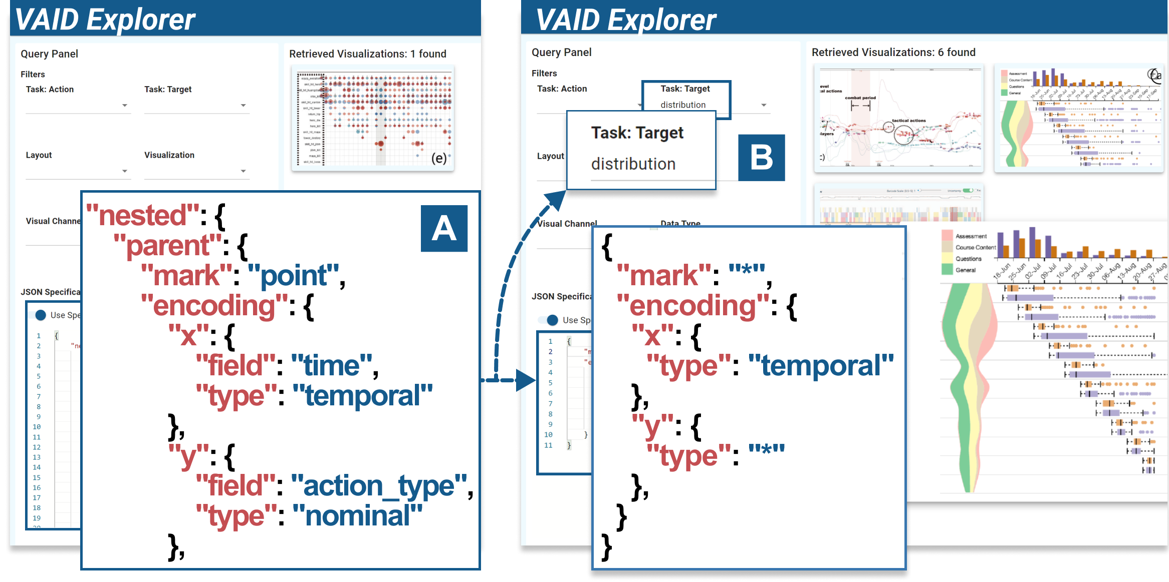
We present a concise scenario featuring Sherry, a visualization researcher in the field of urban planning, to demonstrate the usage of the prototype. She was given a dataset about credit card records, where there are four columns of “card id,” “time,” “store,” and “item name.” She wants to identify the most popular purchasing time and store, but she’s uncertain about how to represent this data. With the VAID Explorer, she first starts from the filtering panel (Fig. 5(A)) and selects two data types, nominal and temporal. Retrieving 46 view designs, she explores the results and discovers that the third example (Fig. 5D) can show the data across “time” and “store.” To further show the popularity of different times and stores, she wonders how to show distribution with a similar design. She copies the index of this design into the indexing view (Fig. 6A). She revises and only keeps the sub-structure of the index, and selects the target of “distribution” (Fig. 6B). She identifies a design with bar charts and area charts showing the summarization of the nominal dimension and temporal dimension, respectively. Based on the example, she has some preliminary thoughts on the view design.
5.2. Study Setup
Our goal is to understand if participants can understand the retrieved designs (e.g., visual encodings) using VAID and use the prototype to obtain design inspirations for VA problems. Specifically, we ask participants to search for visualizations to solve six well-designed VA problems and subsequently, design views. The VA problems have varying complexity and are related to specific analytical tasks, mark types, composition types, or data types, such as “to find visualizations that encode a three-dimensional dataset with a nominal, a quantitative, and a temporal field” and “to find VA designs for comparing distributions”. For the design task, we choose Mini-Challenge 2 from IEEE VAST Challenge 2022 (Chairs, 2022). The detailed list can be found in the supplementary material. Given the retrieved results, participants were asked to explore the results and select one visualization of interest for in-depth investigation, that is, to understand the design by reading images, indexes, and other metadata (e.g., titles and captions). Lastly, we ask participants to explain the design of the visualizations.
Participants. We recruited 12 visualization practitioners (U1-U12) from our institution through social media and word-of-mouth who reported having experience in creating visualizations for data analysis. The participants include 5 females and 7 males with various backgrounds, including computer science, urban, and digital media design. They are used to analyze data with toolkits such as Python, R, and MATLAB for data analysis. In addition, the libraries they use for data visualizations are Vega-Lite, Excel, Python Matplotlib, and Javascript D3. The participants in this user study all have adequate data visualization or design knowledge but have varying expertise in designing more complex VA systems.
Procedure. All studies were conducted through one-on-one online meetings. Each study consisted of two sessions: a training session (15 minutes) and an experiment session (20 minutes). In the training session, we introduced the definitions of VAID, including taxonomies of task and design. Then we introduced the use of the prototype. All participants were allowed to use and explore the data freely to get familiar with the prototype. In the experiment session, each participant was asked to accomplish seven questions (or tasks, but to avoid confusion with the “task” dimension in VAID, we use the term question here). During the whole study, we followed the think-aloud protocol. Participants were requested to speak out about their understanding of the retrieved view design and their thoughts about the VAID or prototype when accomplishing tasks. The study ended with a post-study interview session as well as a questionnaire for rating the VAID from different dimensions. The whole user study lasted about 1-1.5 hours. Each participant received $9 as compensation. The authors took notes to record feedback during the study.
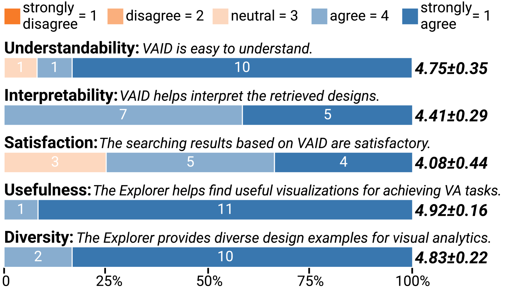
5.3. Results and Feedback
All users successfully found the required designs and comprehended the design using VAID. For Question 7, they designed and sketched several views. All sketches can be found in the supplementary materials. The quantitative results from the participants were very positive, as shown in Fig. 7. Eleven out of twelve participants strongly agreed that based on VAID, the prototype helps to find useful visualization designs for achieving the VA tasks in the study. Similarly, 10 participants strongly appreciated the diversity of VA designs in VAID Explorer.
VAID is easy to understand and benefits design understanding. Most users (11/12) find VAID easy to understand. Some (U1) attribute this ease to their familiarity with Vega-Lite, facilitating a swift adaptation. Others, unfamiliar with Vega-Lite, emphasize the significance of VAID’s JSON format and declarative language for clarity. U6 further emphasized that basic chart knowledge aids in understanding VAID’s design structure. Additionally, users appreciate VAID’s role in simplifying visual encoding comprehension. U5 and U7 noted that VAID complements textual elements like titles and captions, offering insights beyond what these elements convey alone. U1 underscored VAID’s importance in clarifying glyph-related aspects to prevent uncertainties in visual interpretation. Their viewpoint confirmed the fulfillment of design requirement R1. Despite its clarity, U7 still mentioned that referencing the research paper may still be necessary for more complex aspects.
VAID Explorer enables users to swiftly derive initial designs based on the given question. All users start Question 7 very quickly. For example, U12 started by selecting different combinations of “actions” and “targets” values that might conform to the questions and said, “Previously, I required time to grasp background information; however, now I can randomly select filter parameters to explore potential designs. Examining these designs helps me better understand the question and formulate a vague initial design as a starting point.” Users agreed that the structure of VAID aligns with common design strategies, wherein they typically approach the view design by considering data, task, and visualization. U11commented “The filter options align with my way of thinking about the design question. I find it easy to kickstart the process, given that the question description provides the necessary information. Subsequently, I can quickly discover inspiration.”
VAID facilitates comprehensive search. The majority of participants expressed satisfaction with the search results during the exploration. Users pointed out, “While exploring, I aim to retrieve all pertinent designs without any omissions.” U6 complimented, “My personal preferences may introduce biases and potentially result in overlooking valuable papers. The use of the system, however, ensures a more thorough exploration.” Additionally, U4 highlighted, “It operates as a knowledge-based retrieval system, effectively supplementing my knowledge.” Compared to the preliminary study, the extension of VAID facilitates more flexible search options. Specifically, U3 and U5 appreciated the flexible task options when designing a multi-view VA system. They emphasize its effectiveness within a VA system, where the task’s target remains constant while actions vary between views. U5 also commented with an example, ‘‘VAID enables designing VA systems in a manner of progressive exploration, identification, and localization of anomalies.” Their opinion verified that the design requirement R3 had been fulfilled. However, even with the enhanced flexibility in search options provided by VAID, some users still faced challenges while choosing actions. U11 expressed that the concise one-word descriptions lack intuitiveness. She suggests, “including examples and images as hints would help me make more informed task choices.” With the development of large language models (LLMs), a potential solution is to introduce an LLM to help translate the analytic questions into abstract actions and targets, which might lower the burden of using the system.
Moreover, the search function was praised by users for its user-friendly nature, as U11 said, “The filtering and indexing view can complement each other. While the filtering is easy to use but less precise, the index search can assist in retrieving more specific designs, like a bar chart with temporal data on the x-axis.” Despite the positive feedback, there is room for improvement. The current combination of multiple options may result in limited or no results, potentially leading to neutral satisfaction among some users as shown in Fig. 7. U12 recommended incorporating a partial matching mechanism to guarantee a significant number of retrieved designs, even under slightly stringent conditions. U8 echoed similar sentiments, proposing the addition of a recommendation mechanism akin to common search engines. Additionally, U5 expressed a desire for improved linkage between the filtering view and the indexing view. He mentioned, “Typing a JSON structure from scratch is not easy, but editing one is simpler.” U5 hoped for an initial draft in the index view after selecting options in the filtering view. Therefore, valid ranking mechanisms and linkage query functions for view designs can be developed in the future to support an effective visualization query system.
VAID facilitates incremental design, helping users refine their designs step by step. View designs are mainly composite visualizations (Deng et al., 2023a), which can be further broken down into various basic charts (Sec. 4.2). Designers usually start from one basic visualization type that can be decided. For example, many users recognize “maps” in Question 7 due to the urban scenario. Some users also search for initial designs by integrating data, tasks, and their expertise. Building upon this concept, the VAID Explorer empowers users to employ basic visualizations as search parameters, enabling the design of intricate and extended designs (R2). U10 stated, “I usually use several basic charts to meet design requirements. After that, I explore ways to refine the design by integrating these charts into a unified view.” She believed that using our tool makes this refinement step easier than before. U9 conveyed a strong appreciation for layouts, citing challenges in keyword-based searches due to reliance on personal knowledge, “VAID Explorer addresses this by offering nested or layered layout options”. This preference aligns with sentiments from U5 and U7, who stress spatial constraints in VA views and the importance of thoughtful layout choices within limited space. Meanwhile, some users also suggest that the complexity of the design allows for a selective approach to the retrieved designs. For example, in Question 7.3, U7 may opt to utilize only the color and size encoding within a view design from TPFlow (Liu et al., 2019). U5 also employed a similar approach. Initially, he selected the circular bar design from one view in (Zhou et al., 2019), and later chose the area chart design from one view in (Zhao et al., 2017) to address the question.
VAID enhances design aesthetics. VAID not only aids in completing a design but also provides additional assistance, as highlighted by U2, who pointed out that VAID contributes to enhancing aesthetics during view design. Moreover, users may further improve the design using VAID, even when it effectively achieves the intended task. For example, in Question 7.1, U9 initially obtained a design that satisfied the question. However, upon observing a particular view in Volia (Cao et al., 2018), she recognized the potential of using quadrilaterals or hexagons as the smallest units during map segmentation, which helped her to refine the design accordingly. In Question 7.3, U6 noticed that bar charts were commonly used in previous designs, leading to boring designs that lack adequate novelty. This prompted U6 to explore alternative views within the last referred VA interface, aiming for more varied designs. By combining this exploration with insights from the VAID structure, U6 took a radical approach.
6. The analysis of VA design collection using VAID
After validating the usefulness of VAID, we explore the “design demographics” (Hoque and Agrawala, 2020; Battle et al., 2018) based on VAID for view designs with collected views in Sec. 3.1, which demonstrates VAID enables fine-grained exploration and understanding of existing view designs. In particular, we report on the statistics, including the frequency and co-occurrence patterns for the analytical tasks and visual designs.
6.1. Overview
We first analyze the indexes to understand the composition of visualization designs in visual analytics.
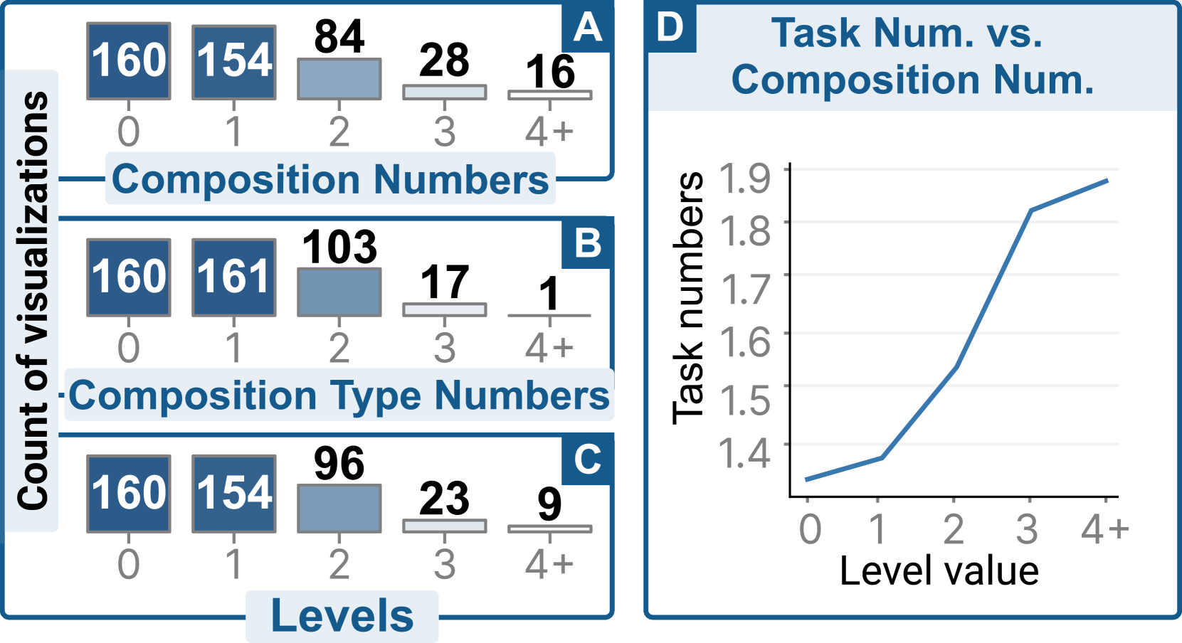
Only 38% view designs can be implemented with Vega-Lite. We investigated the indexes and opted to understand whether these visualizations can be implemented with common compositions (layer, concat, and facet) of basic mark types with Vega-Lite. We discovered that only 38.2% (169/442) designs could be specified with pure Vega-Lite structures. The results indicate that researchers tend to use novel techniques in VA systems to visualize the data, which demonstrates the unique value of our structures. The limitations of Vega-Lite mainly lie in the limited mark types and the lack of support for graph-related data and nested visualizations. The limited expressiveness of declarative visualization grammars may be a reason for the result that the visualization designs of most existing VA systems are implemented with lower-level Javascript libraries (e.g., D3.js), as they could provide flexible customizations for the designs.
About 64% view designs are composite visualizations. Composite visualizations combine multiple visual components together along specific directions (e.g., “layer”, “concat” and “facet” in Vega-Lite) or in a hierarchical manner (i.e., “nested”), which can make the visual components well-organized and easy to interpret. As shown in Fig. 8A, 63.8% (282/442) of the view designs contain composite visualizations. We focus on the number of composition labels in a structure. Fig. 8A shows that 34.8% (154/442) of visualizations contain only one composition. 3.6% (16/442) visualizations contain at least four compositions. A visualization can have several types of compositions (four different types in total). Only one visualization has used the maximum number of different composition types, which is four (Fig. 8B). Fig. 8B shows that most visualizations have no more than two composition types.
90% composite visualizations have a hierarchy level 2. As described in subsection 4.2, the visualization is represented in a hierarchical JSON syntax with multiple levels of composition. For example, the visualization presented in Fig. 3 has a composition level of three. For composite visualizations, 54.6% (154/282) have a level of one, 34.0% (96/282) have a level of two, and 8.1% (23/282) have a level of three. Only 9 visualizations have a level of four, which is the maximum level of the hierarchy. The numbers indicate that most composite visualizations only use one or two levels of composition. Adding more levels of composition demands encoding more data columns, which might go beyond the requirement of analysis scenarios. Moreover, more levels of composition increase implementation difficulty and visual complexity.
More compositions, more tasks achieved. Investigating VAID, we discover that all visualizations have at least one action-target task. The ones with composition achieve 1.49 tasks on average, while the ones without composition are designed for 1.33 tasks on average. Fig. 8D shows the average number of tasks vs. the number of compositions. Overall, the number of tasks to be solved will increase with the increase of compositions.
6.2. Frequency Analysis
We then report on the frequency of different property values and findings in VAID.
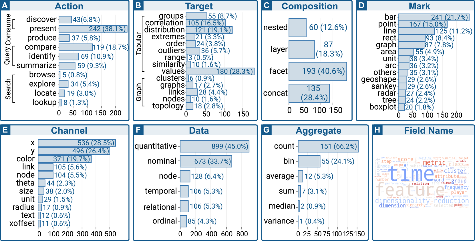
Actions: “low-level” actions are the most used analytic actions. As shown in Fig. 9A, present is the most frequent action. The results show that many designs are merely used for data exhibition. Therefore, we excluded present in the later analysis since designers commonly use terms like “show,” “visualize,” and other ambiguous words to explain their use of such view designs. After excluding this category, compare, identify, and summarize are the most popular. These three actions are categorized into “low-level” query actions by Brehmer and Munzner (Brehmer and Munzner, 2013). For the goal of searching, explore is the most popular one, which stands for exploratory analysis. Interestingly, we did not discover designs that are used for enjoy, showing the difference between visual analytics and infographics.
Targets: domain-specific values are the most popular targets. From target distribution (Fig. 9B), we discovered that the most popular target is value, which refers to visualizing values that are computed from metrics or algorithms. This reflects the features of VA, which closely collaborates with domains and utilizes data mining techniques for data preprocessing. Distribution and correlation are the second and third popular targets. The results demonstrate that understanding the correlations and distributions of the attributes are the key indicators for data patterns in VA. For graph data, links and the whole graphs are the most frequently visualized targets.
Compositions: simple is preferable. Composition distribution is presented in Fig. 9C. Facet, which organizes visualizations of the same types by rows and columns, is the most used composition type in VA. This simple composition conveniently visualizes one or two more dimensions with simple visualization building blocks (e.g., scatterplot matrix). Concat is the second popular type, which refers to placing visualizations with different types side by side. Nested composition is not covered by the original Vega-Lite. Although it has the smallest proportion, it accounts for more than 10%.
Marks: basic types dominate. In a composite visualization, each visual component is regarded as a specific mark type. We display the mark types that have more than 20 records (Fig. 9D). The distribution demonstrates that bar, point, line, and rect are the most popular mark types, which are also basic mark types in Vega-Lite. For the types that Vega-Lite does not cover, graph and unit (Park et al., 2017) visualizations rank and among all types. The type others ranks , indicating that glyph visualizations are also commonly used in view designs.
Channels: most relate to the Cartesian coordinate system. We show the visual channels with more than 10 records in Fig. 9E. The channels x, y, and color are the most popular. The channels link and node are also frequently used because of the graph-related visualizations, such as Sankey diagrams, graphs, and trees.
Data Types: about 90% fields are quantitative and nominal. Among all data types, quantitative data and nominal data are the most frequently encoded in the visualizations (Fig. 9F), followed by node data, which is commonly used in graph data.
Aggregate: binning/counting, or more complex operations. Aggregate types are labeled based on Vega-Lite aggregation operations (Fig. 9G). Aggregate count and bin are the most frequently used types, which are usually because of the visualization of histograms. Other aggregate types are not frequently used in view designs. The reason might be that complex data processing methods and metrics are adopted in VA, instead of basic aggregation strategies, such as sum, median, and variance.
Field Names: time and feature analysis are main characters. Field names are the terms used in the original VA research papers describing the fields. We show the word frequency of field names using word cloud (Fig. 9H). From the word cloud, we immediately discover that the words time, feature, metric, and dimensionality reduction have a relatively large size, indicating the values about these terms are frequently used in VA research.
7. Discussion
In this section, we discuss the potential avenues for future research on VAID and its limitations.
7.1. Opportunties for Future Research
We identified multiple research opportunities grouped into three primary avenues.
First, VAID offers the potential to enhance view design assessment. While our statistical analysis of 442 designs has yielded valuable insights (Sec. 6), there remains an opportunity for deeper analysis through the integration of VAID. For example, in the current process of VA design, the selection of design alternatives is mainly guided by design principles (Wu et al., 2023). VAID can retrieve potentially useful designs regarding data and tasks, which complements design alternatives for a more comprehensive discussion and justifications. Such an index structure accompanied by a database can help to improve the rigor of VA research. Future research can focus on developing an evaluation method for VA designs based on VAID since this structured approach transforms abstract designs into a more analyzable format, enabling the application of various analysis techniques (e.g., regression, clustering).
Second, VAID presents the opportunity to simplify comparisons of view designs. Although VA designs have long been criticized for their over-crafted designs for specific domain problems (Wu et al., 2023), they might share similarities in specific views, components, and tasks. As highlighted by U5 and U9, the importance of comparing designs cannot be understated during the exploration process. VAID allows for comparisons in different dimensions, revealing both commonalities and differences in analytical tasks and visual designs. Future research can focus on enhancing the effectiveness of comparisons between different designs.
Thirdly, we envision VAID as an initial step toward enhancing the automation in VA. While there have been efforts to automate the creation of visualizations (Wu et al., 2022), there has been limited exploration of automation within the realm of complex VA design. Automating VA design requires large-scale datasets in need of training, which necessitates detailed information for VA designs. One challenge in this regard is the mismatch between the intensive visual information conveyed and the limited accessible information through captions and figures. In this regard, VAID takes on a crucial role as an initial step in augmenting the accessible information. Additionally, we encourage the open-sourcing of more VA systems, as they represent valuable outcomes of iterative design. The designs and system code shared through open-source projects will serve as valuable resources for the community. Through these collective efforts, we can gradually simplify the production process of VA systems, ultimately achieving automation in VA design.
7.2. Limitations
As a first attempt to construct an index structure for VA design from the perspectives of tasks and visual designs, our work has several limitations that warrant future research.
Interactions. Interactions are important features of VA systems. However, it is difficult to recognize the interactions from VA designs, even in an entirely manual manner, since not all interactions within/between views are introduced in the original papers. Moreover, the use of static images hiders our analysis of configurable VA systems (e.g., Turkay et al. (Turkay et al., 2016)), as the configuration frameworks are not reflected in the images. Facilitating better analysis of view relationships requires parsing live VA systems and constructing the data flow between views.
Generalizability. In this study, we designed and evaluated VAID based on high-quality VA designs from top-tier conference papers. These designs make up a corpus that comprises composite and multiple-view visualizations, which were recognized to be complex and hard to understand (Wu et al., 2023). As a result, VAID is capable of representing visualization designs with complex structures. We believe that VAID can be used to index and represent a wider range of visualization designs, such as infographics, which are usually facilitated with novel layouts and glyphs (Ying et al., 2022) that improve the expressiveness of information. However, it introduces additional challenges because infographics usually contain distorted graphical elements for metaphoric representation (Ying et al., 2023a) and the combination of additional modalities, such as text and images. In this study, we started from the VA community and derived VAID as a kickoff for the research of indexing such complex visualizations. It requires future research to evaluate and extend VAID with a more general dataset.
Evaluation. In our two in-lab studies, participants are required to complete the VAST mini-challenge in a short time. We hope to synthesize the scenario of creating VA designs, but real-world VA design often involves collaboration with domain experts. While we tried to avoid tasks requiring specialized knowledge, fully simulating authentic collaborative scenarios remains a challenge. In the future, we hope to carry on a field study with VAID, asking VA experts to use VAID in their routine design process, observing their behaviors, and gathering more comprehensive feedback from their experience.
Scalability. In this work, the scalability of annotation is limited because it requires extensive visualization knowledge for annotating such a fine-grained structure. Our work is rooted in the fact that there lack of practical rules and guidance in decomposing view designs in VA. As a starting point, we manually annotate and fine-tune the structure iteratively with a workshop study, aiming to construct a solid foundation for the indexing. Such manual efforts were expensive and resulted in a relatively small dataset size. In the future, we plan to improve VAID with a combination of machine learning methods. These methods not only ease the effort of manual labeling but also enhance the information available. In terms of the former, approaches like VisImages (Deng et al., 2023c) leverage computer vision models to detect view locations in research papers. Efforts can also be made to extract visual structures such as maps (Poco et al., 2018), charts (Poco and Heer, 2017; Savva et al., 2011; Ying et al., 2023b), and PowerPoint slides (Shi et al., 2022). It is possible to adopt deep learning models to detect the positions of visual elements and reconstruct their relations. Regarding the latter, additional information can be valuable. For instance, utilizing computer vision models to derive color palettes aids in analyzing the emotional tone of designs (Lan et al., 2023) and inspires future designers (Shi et al., 2023). Annotations and other text information extracted using OCR techniques (Memon et al., 2020) from charts can serve as supplementary material, aiding users in understanding essential information such as the data narrative and context (Ren et al., 2017).
8. conclusion
We built an index structure, VAID, from visual analytics research papers. The structure features an index for describing complex VA designs from the perspectives of analytical tasks and visual designs. VAID is constructed iteratively through a workshop study with 12 VA designers. The structure provides opportunities to understand and utilize state-of-the-art visualization designs, which are demonstrated through a user study. However, given that designing a visual analytics system is a complex procedure, we note that our work is the first step toward understanding and indexing VA systems. We hope that our VAID and lessons learned could provide a helpful foundation for further research.
Acknowledgements.
The work was supported by NSF of China (U22A2032) and the Collaborative Innovation Center of Artificial Intelligence by MOE and Zhejiang Provincial Government. The work was also partially supported by the Ministry of Education, Singapore, under its Academic Research Fund Tier 2 (Proposal ID: T2EP20222-0049).References
- (1)
- Amar et al. (2005) R. Amar, J. Eagan, and J. Stasko. 2005. Low-Level Components of Analytic Activity in Information Visualization. In Proceedings of IEEE Symposium on Information Visualization. 111–117.
- Battle et al. (2018) Leilani Battle, Peitong Duan, Zachery Miranda, Dana Mukusheva, Remco Chang, and Michael Stonebraker. 2018. Beagle: Automated Extraction and Interpretation of Visualizations from the Web. In Proceedings of CHI Conference on Human Factors in Computing Systems. 1–8.
- Bigelow et al. (2014) Alex Bigelow, Steven Drucker, Danyel Fisher, and Miriah Meyer. 2014. Reflections on How Designers Design with Data. In Proceedings of the International Working Conference on Advanced Visual Interfaces. 17–24. https://doi.org/10.1145/2598153.2598175
- Borgo et al. (2013) Rita Borgo, Johannes Kehrer, David HS Chung, Eamonn Maguire, Robert S Laramee, Helwig Hauser, Matthew Ward, and Min Chen. 2013. Glyph-Based Visualization: Foundations, Design Guidelines, Techniques and Applications.. In Proceedings of Eurographics Conference on Visualization (State of the Art Reports). 39–63.
- Borkin et al. (2013) Michelle A. Borkin, Azalea A. Vo, Zoya Bylinskii, Phillip Isola, Shashank Sunkavalli, Aude Oliva, and Hanspeter Pfister. 2013. What Makes a Visualization Memorable? IEEE Transactions on Visualization and Computer Graphics 19, 12 (2013), 2306–2315. https://doi.org/10.1109/TVCG.2013.234
- Bostock et al. (2011) Michael Bostock, Vadim Ogievetsky, and Jeffrey Heer. 2011. D Data-Driven Documents. IEEE Transactions on Visualization and Computer Graphics 17, 12 (2011), 2301–2309. https://doi.org/10.1109/TVCG.2011.185
- Brehmer and Munzner (2013) Matthew Brehmer and Tamara Munzner. 2013. A Multi-Level Typology of Abstract Visualization Tasks. IEEE Transactions on Visualization and Computer Graphics 19, 12 (2013), 2376–2385. https://doi.org/10.1109/TVCG.2013.124
- Cao et al. (2021) Anqi Cao, Xiao Xie, Ji Lan, Huihua Lu, Xinli Hou, Jiachen Wang, Hui Zhang, Dongyu Liu, and Yingcai Wu. 2021. MIG-Viewer: Visual Analytics of Soccer Player Migration. Visual Informatics 5, 3 (2021). https://doi.org/10.1016/j.visinf.2021.09.002
- Cao et al. (2018) Nan Cao, Chaoguang Lin, Qiuhan Zhu, Yu-Ru Lin, Xian Teng, and Xidao Wen. 2018. Voila: Visual Anomaly Detection and Monitoring with Streaming Spatiotemporal Data. IEEE Transactions on Visualization and Computer Graphics 24, 1 (2018), 23–33. https://doi.org/10.1109/TVCG.2017.2744419
- Card et al. (1999) Stuart K. Card, Jock D. Mackinlay, and Ben Shneiderman. 1999. Readings in Information Visualization: Using Vision to Think. Academic Press.
- Chairs (2022) VAST Challenge Committee Chairs. 2022. VAST Challenge 2022.
- Chen et al. (2021a) Jian Chen, Meng Ling, Rui Li, Petra Isenberg, Tobias Isenberg, Michael Sedlmair, Torsten Möller, Robert S. Laramee, Han-Wei Shen, Katharina Wünsche, and Qiru Wang. 2021a. VIS30K: A Collection of Figures and Tables from IEEE Visualization Conference Publications. IEEE Transactions on Visualization and Computer Graphics 27, 9 (2021), 3826–3833. https://doi.org/10.1109/TVCG.2021.3054916
- Chen et al. (2021b) Xi Chen, Wei Zeng, Yanna Lin, Hayder Mahdi AI-maneea, Jonathan Roberts, and Remco Chang. 2021b. Composition and Configuration Patterns in Multiple-View Visualizations. IEEE Transactions on Visualization and Computer Graphics 27, 2 (2021), 1514–1524. https://doi.org/10.1109/TVCG.2020.3030338
- Chi (2000) Ed Huai-hsin Chi. 2000. A Taxonomy of Visualization Techniques Using the Data State Reference Model. In IEEE Symposium on Information Visualization. 69–75.
- Deng et al. (2023a) Dazhen Deng, Weiwei Cui, Xiyu Meng, Mengye Xu, Yu Liao, Haidong Zhang, and Yingcai Wu. 2023a. Revisiting the Design Patterns of Composite Visualizations. IEEE Transactions on Visualization and Computer Graphics 29, 12 (2023), 5406–5421. https://doi.org/10.1109/TVCG.2022.3213565
- Deng et al. (2022) Dazhen Deng, Aoyu Wu, Huamin Qu, and Yingcai Wu. 2022. DashBot: Insight-Driven Dashboard Generation Based on Deep Reinforcement Learning. IEEE Transactions on Visualization and Computer Graphics 29, 1 (2022), 690–700. https://doi.org/10.1109/TVCG.2022.3209468
- Deng et al. (2023c) Dazhen Deng, Yihong Wu, Xinhuan Shu, Jiang Wu, Siwei Fu, Weiwei Cui, and Yingcai Wu. 2023c. VisImages: A Fine-Grained Expert-Annotated Visualization Dataset. IEEE Transactions on Visualization and Computer Graphics 29, 7 (2023), 3298–3311. https://doi.org/10.1109/TVCG.2022.3155440
- Deng et al. (2023b) Zikun Deng, Di Weng, Shuhan Liu, Yuan Tian, Mingliang Xu, and Yingcai Wu. 2023b. A Survey of Urban Visual Analytics: Advances and Future Directions. Computational Visual Media 9, 1 (2023), 3–39. https://doi.org/10.1007/s41095-022-0275-7
- Elmqvist and Fekete (2010) Niklas Elmqvist and Jean-Daniel Fekete. 2010. Hierarchical Aggregation for Information Visualization: Overview, Techniques, and Design Guidelines. IEEE Transactions on Visualization and Computer Graphics 16, 3 (2010), 439–454. https://doi.org/10.1109/TVCG.2009.84
- Engelhardt and Richards (2018) Yuri Engelhardt and Clive Richards. 2018. A Framework for Analyzing and Designing Diagrams and Graphics. In Proceedings of International Conference on Theory and Application of Diagrams. 201–209.
- Fu et al. (2017) Siwei Fu, Jian Zhao, Weiwei Cui, and Huamin Qu. 2017. Visual Analysis of MOOC Forums with iForum. IEEE Transactions on Visualization and Computer Graphics 23, 1 (2017), 201–210. https://doi.org/10.1109/TVCG.2016.2598444
- Gou et al. (2021) Liang Gou, Lincan Zou, Nanxiang Li, Michael Hofmann, Arvind Kumar Shekar, Axel Wendt, and Liu Ren. 2021. VATLD: A Visual Analytics System to Assess, Understand and Improve Traffic Light Detectio. IEEE Transactions on Visualization and Computer Graphics 27, 2 (2021), 261–271. https://doi.org/10.1109/TVCG.2020.3030350
- Harris (1999) Robert L Harris. 1999. Information Graphics: A Comprehensive Illustrated Reference.
- Heer and Bostock (2010) Jeffrey Heer and Michael Bostock. 2010. Declarative Language Design for Interactive Visualization. IEEE Transactions on Visualization and Computer Graphics 16, 6 (2010), 1149–1156. https://doi.org/10.1109/TVCG.2010.144
- Herring et al. (2009) Scarlett R. Herring, Chia-Chen Chang, Jesse Krantzler, and Brian P. Bailey. 2009. Getting Inspired!: Understanding How and Why Examples Are Used in Creative Design Practice. In Proceedings of the SIGCHI Conference on Human Factors in Computing Systems. 87–96. https://doi.org/10.1145/1518701.1518717
- Hoque and Agrawala (2020) Enamul Hoque and Maneesh Agrawala. 2020. Searching the Visual Style and Structure of D3 Visualizations. IEEE Transactions on Visualization and Computer Graphics 26, 1 (2020), 1236–1245. https://doi.org/10.1109/TVCG.2019.2934431
- Hu et al. (2019) Kevin Hu, Snehalkumar’Neil’S Gaikwad, Madelon Hulsebos, Michiel A Bakker, Emanuel Zgraggen, César Hidalgo, Tim Kraska, Guoliang Li, Arvind Satyanarayan, and Çağatay Demiralp. 2019. Viznet: Towards a Large-Scale Visualization Learning and Benchmarking Repository. In Proceedings of the CHI Conference on Human Factors in Computing Systems. 1–12.
- Javed and Elmqvist (2012) Waqas Javed and Niklas Elmqvist. 2012. Exploring the Design Space of Composite Visualization. In Proceedings of IEEE Pacific Visualization Symposium. 1–8.
- Keim et al. (2008a) Daniel Keim, Gennady Andrienko, Jean-Daniel Fekete, Carsten Görg, Jörn Kohlhammer, and Guy Melançon. 2008a. Visual Analytics: Definition, Process, and Challenges. In Information Visualization. 154–175.
- Keim et al. (2008b) Daniel A. Keim, Florian Mansmann, Jörn Schneidewind, Jim Thomas, and Hartmut Ziegler. 2008b. Visual Analytics: Scope and Challenges. In Proceedings of Visual Data Mining: Theory, Techniques and Tools for Visual Analytics. Lecture Notes in Computer Science, Vol. 4404. 76–90. https://doi.org/10.1007/978-3-540-71080-6_6
- Krueger et al. (2020) Robert Krueger, Johanna Beyer, Won-Dong Jang, Nam Wook Kim, Artem Sokolov, Peter K. Sorger, and Hanspeter Pfister. 2020. Facetto: Combining Unsupervised and Supervised Learning for Hierarchical Phenotype Analysis in Multi-Channel Image Data. IEEE Transactions on Visualization and Computer Graphics 26, 1 (2020), 227–237. https://doi.org/10.1109/TVCG.2019.2934547
- Kui et al. (2022) Xiaoyan Kui, Naiming Liu, Qiang Liu, Jingwei Liu, Xiaoqian Zeng, and Chao Zhang. 2022. A Survey of Visual Analytics Techniques for Online Education. Visual Informatics 6, 4 (2022). https://doi.org/10.1016/j.visinf.2022.07.004
- Lan et al. (2023) Xingyu Lan, Yanqiu Wu, and Nan Cao. 2023. Affective Visualization Design: Leveraging the Emotional Impact of Data. IEEE Transactions on Visualization and Computer Graphics (2023), 1–11. https://doi.org/10.1109/TVCG.2023.3327385
- Lee et al. (2006) Bongshin Lee, Catherine Plaisant, Cynthia Sims Parr, Jean-Daniel Fekete, and Nathalie Henry. 2006. Task Taxonomy for Graph Visualization. In Proceedings of AVI Workshop on BEyond Time and Errors: Novel Evaluation Methods for Information Visualization. 1–5. https://doi.org/10.1145/1168149.1168168
- Lee et al. (2010) Brian Lee, Savil Srivastava, Ranjitha Kumar, Ronen Brafman, and Scott R. Klemmer. 2010. Designing with Interactive Example Galleries. In Proceedings of the SIGCHI Conference on Human Factors in Computing Systems. 2257–2266. https://doi.org/10.1145/1753326.1753667
- Lekschas et al. (2018) Fritz Lekschas, Benjamin Bach, Peter Kerpedjiev, Nils Gehlenborg, and Hanspeter Pfister. 2018. HiPiler: Visual Exploration of Large Genome Interaction Matrices with Interactive Small Multiples. IEEE Transactions on Visualization and Computer Graphics 24, 1 (2018), 522–531. https://doi.org/10.1109/TVCG.2017.2745978
- Li et al. (2018) Deqing Li, Honghui Mei, Yi Shen, Shuang Su, Wenli Zhang, Junting Wang, Ming Zu, and Wei Chen. 2018. ECharts: A Declarative Framework for Rapid Construction of Web-Based Visualization. Visual Informatics 2, 2 (2018), 136–146. https://doi.org/10.1016/j.visinf.2018.04.011
- Li et al. (2022) Haotian Li, Yong Wang, Aoyu Wu, Huan Wei, and Huamin Qu. 2022. Structure-Aware Visualization Retrieval. In Proceedings of CHI Conference on Human Factors in Computing Systems. https://doi.org/10.1145/3491102.3502048
- Liu et al. (2019) Dongyu Liu, Panpan Xu, and Liu Ren. 2019. TPFlow: Progressive Partition and Multidimensional Pattern Extraction for Large-Scale Spatio-Temporal Data Analysis. IEEE Transactions on Visualization and Computer Graphics 25, 1 (2019), 1–11. https://doi.org/10.1109/TVCG.2018.2865018
- Lohse et al. (1994) Gerald L Lohse, Kevin Biolsi, Neff Walker, and Henry H Rueter. 1994. Classification with Invariant Scattering Representations. Commun. ACM 37, 12 (1994), 36–50. https://doi.org/10.1145/198366.198376
- Lu et al. (2023) Qiang Lu, Yifan Ge, Jingang Rao, Liang Ling, Ye Yu, and Zhenya Zhang. 2023. WaterExcVA: A System for Exploring and Visualizing Data Exception in Urban Water Supply. Journal of Visualization 26, 4 (2023). https://doi.org/10.1007/s12650-023-00911-9
- LYi et al. (2021) Sehi LYi, Jaemin Jo, and Jinwook Seo. 2021. Comparative Layouts Revisited: Design Space, Guidelines, and Future Directions. IEEE Transactions on Visualization and Computer Graphics 27, 2 (2021), 1525–1535. https://doi.org/10.1109/TVCG.2020.3030419
- Mackinlay (1986) Jock Mackinlay. 1986. Automating the Design of Graphical Presentations of Relational Information. ACM Transactions on Graphics 5, 2 (1986), 110–141. https://doi.org/10.1145/22949.22950
- Meirelles (2013) Isabel Meirelles. 2013. Design for Information: An Introduction to the Histories, Theories, and Best Practices behind Effective Visualizations.
- Memon et al. (2020) Jamshed Memon, Maira Sami, Rizwan Ahmed Khan, and Mueen Uddin. 2020. Handwritten Optical Character Recognition (OCR): A Comprehensive Systematic Literature Review (SLR). IEEE access : practical innovations, open solutions 8 (2020), 142642–142668. https://doi.org/10.1109/ACCESS.2020.3012542
- Munzner (2009) Tamara Munzner. 2009. A Nested Model for Visualization Design and Validation. IEEE Transactions on Visualization and Computer Graphics 15, 6 (2009), 921–928. https://doi.org/10.1109/TVCG.2009.111
- Munzner (2014) Tamara Munzner. 2014. Visualization Analysis and Design.
- Ono et al. (2021) Jorge Piazentin Ono, Sonia Castelo, Roque Lopez, Enrico Bertini, Juliana Freire, and Claudio Silva. 2021. PipelineProfiler: A Visual Analytics Tool for the Exploration of AutoML Pipelines. IEEE Transactions on Visualization and Computer Graphics 27, 2 (2021), 390–400. https://doi.org/10.1109/TVCG.2020.3030361
- Park et al. (2017) Deokgun Park, Steven M Drucker, Roland Fernandez, and Niklas Elmqvist. 2017. Atom: A Grammar for Unit Visualizations. IEEE Transactions on Visualization and Computer Graphics 24, 12 (2017), 3032–3043. https://doi.org/10.1109/TVCG.2017.2785807
- Poco and Heer (2017) Jorge Poco and Jeffrey Heer. 2017. Reverse-Engineering Visualizations: Recovering Visual Encodings from Chart Images. Computer Graphics Forum 36, 3 (2017), 353–363. https://doi.org/10.1111/cgf.13193
- Poco et al. (2018) Jorge Poco, Angela Mayhua, and Jeffrey Heer. 2018. Extracting and Retargeting Color Mappings from Bitmap Images of Visualizations. IEEE Transactions on Visualization and Computer Graphics 24, 1 (2018), 637–646. https://doi.org/10.1109/TVCG.2017.2744320
- Ren et al. (2017) Donghao Ren, Matthew Brehmer, Bongshin Lee, Tobias Hollerer, and Eun Kyoung Choe. 2017. ChartAccent: Annotation for Data-Driven Storytelling. In IEEE Pacific Visualization Symposium. 230–239. https://doi.org/10.1109/PACIFICVIS.2017.8031599
- Sacha et al. (2014) Dominik Sacha, Andreas Stoffel, Florian Stoffel, Bum Chul Kwon, Geoffrey Ellis, and Daniel A. Keim. 2014. Knowledge Generation Model for Visual Analytics. IEEE Transactions on Visualization and Computer Graphics 20, 12 (2014), 1604–1613. https://doi.org/10.1109/TVCG.2014.2346481
- Satyanarayan et al. (2017) Arvind Satyanarayan, Dominik Moritz, Kanit Wongsuphasawat, and Jeffrey Heer. 2017. Vega-Lite: A Grammar of Interactive Graphics. IEEE Transactions on Visualization and Computer Graphics 23, 1 (2017), 341–350. https://doi.org/10.1109/TVCG.2016.2599030
- Savva et al. (2011) Manolis Savva, Nicholas Kong, Arti Chhajta, Li Fei-Fei, Maneesh Agrawala, and Jeffrey Heer. 2011. ReVision: Automated Classification, Analysis and Redesign of Chart Images. In In Proceedings of Annual ACM Symposium on User Interface Software and Technology. 393–402.
- Shi et al. (2022) Danqing Shi, Weiwei Cui, Danqing Huang, Haidong Zhang, and Nan Cao. 2022. Reverse-Engineering Information Presentations: Recovering Hierarchical Grouping from Layouts of Visual Elements. CoRR abs/2201.05194 (2022).
- Shi et al. (2023) Xinyu Shi, Ziqi Zhou, Jing Wen Zhang, Ali Neshati, Anjul Kumar Tyagi, Ryan Rossi, Shunan Guo, Fan Du, and Jian Zhao. 2023. De-Stijl: Facilitating Graphics Design with Interactive 2D Color Palette Recommendation. In Proceedings of the CHI Conference on Human Factors in Computing Systems. 1–19. https://doi.org/10.1145/3544548.3581070
- Shneiderman (2002) Ben Shneiderman. 2002. Creativity Support Tools. Commun. ACM 45, 10 (2002), 116–120. https://doi.org/10.1145/570907.570945
- Srinivasan et al. (2018) Arjun Srinivasan, Steven M Drucker, Alex Endert, and John Stasko. 2018. Augmenting Visualizations with Interactive Data Facts to Facilitate Interpretation and Communication. IEEE Transactions on Visualization and Computer Graphics 25, 1 (2018), 672–681. https://doi.org/10.1109/TVCG.2018.2865145
- Stein et al. (2018) Manuel Stein, Halldor Janetzko, Andreas Lamprecht, Thorsten Breitkreutz, Philipp Zimmermann, Bastian Goldlücke, Tobias Schreck, Gennady Andrienko, Michael Grossniklaus, and Daniel A. Keim. 2018. Bring It to the Pitch: Combining Video and Movement Data to Enhance Team Sport Analysis. IEEE Transactions on Visualization and Computer Graphics 24, 1 (2018), 13–22. https://doi.org/10.1109/TVCG.2017.2745181
- Turkay et al. (2016) Cagatay Turkay, Erdem Kaya, Selim Balcisoy, and Helwig Hauser. 2016. Designing Progressive and Interactive Analytics Processes for High-Dimensional Data Analysis. IEEE transactions on visualization and computer graphics 23, 1 (2016), 131–140. https://doi.org/10.1109/TVCG.2016.2598470
- Viegas et al. (2007) Fernanda B. Viegas, Martin Wattenberg, Frank van Ham, Jesse Kriss, and Matt McKeon. 2007. ManyEyes: A Site for Visualization at Internet Scale. IEEE Transactions on Visualization and Computer Graphics 13, 6 (2007), 1121–1128. https://doi.org/10.1109/TVCG.2007.70577
- Wilkinson (2012) Leland Wilkinson. 2012. The Grammar of Graphics: The Ggplot2 Package. In Handbook of Computational Statistics. 375–414.
- Wu et al. (2023) Aoyu Wu, Dazhen Deng, Furui Cheng, Yingcai Wu, Shixia Liu, and Huamin Qu. 2023. In Defence of Visual Analytics Systems: Replies to Critics. IEEE Transactions on Visualization and Computer Graphics 29, 1 (2023), 1026–1036. https://doi.org/10.1109/TVCG.2022.3209360
- Wu et al. (2022) Aoyu Wu, Yun Wang, Xinhuan Shu, Dominik Moritz, Weiwei Cui, Haidong Zhang, Dongmei Zhang, and Huamin Qu. 2022. AI4VIS: Survey on Artificial Intelligence Approaches for Data Visualization. , 5049–5070 pages. https://doi.org/10.1109/TVCG.2021.3099002
- Ye et al. (2022) Yilin Ye, Rong Huang, and Wei Zeng. 2022. VISAtlas: An Image-Based Exploration and Query System for Large Visualization Collections via Neural Image Embedding. IEEE Transactions on Visualization and Computer Graphics (2022), 1–15. https://doi.org/10.1109/TVCG.2022.3229023
- Ying et al. (2023a) Lu Ying, Xinhuan Shu, Dazhen Deng, Yuchen Yang, Tan Tang, Lingyun Yu, and Yingcai Wu. 2023a. MetaGlyph: Automatic Generation of Metaphoric Glyph-based Visualization. IEEE Transactions on Visualization and Computer Graphics 29, 1 (2023), 331–341. https://doi.org/10.1109/TVCG.2022.3209447
- Ying et al. (2022) Lu Ying, Tan Tangl, Yuzhe Luo, Lvkeshen Shen, Xiao Xie, Lingyun Yu, and Yingcai Wu. 2022. GlyphCreator: Towards Example-based Automatic Generation of Circular Glyphs. IEEE Transactions on Visualization and Computer Graphics 28, 1 (2022). https://doi.org/10.1109/TVCG.2021.3114877
- Ying et al. (2023b) Lu Ying, Yun Wang, Haotian Li, Shuguang Dou, Haidong Zhang, Xinyang Jiang, Huamin Qu, and Yingcai Wu. 2023b. Reviving Static Charts into Live Charts.
- Zhao et al. (2017) Jian Zhao, Michael Glueck, Simon Breslav, Fanny Chevalier, and Azam Khan. 2017. Annotation Graphs: A Graph-Based Visualization for Meta-Analysis of Data Based on User-Authored Annotations. IEEE Transactions on Visualization and Computer Graphics 23, 1 (2017), 261–270. https://doi.org/10.1109/TVCG.2016.2598543
- Zhou et al. (2023) Yuhua Zhou, Xiyu Meng, Yanhong Wu, Tan Tang, Yongheng Wang, and Yingcai Wu. 2023. An Intelligent Approach to Automatically Discovering Visual Insights. Journal of Visualization 26, 3 (2023). https://doi.org/10.1007/s12650-022-00894-z
- Zhou et al. (2019) Zhiguang Zhou, Linhao Meng, Cheng Tang, Ying Zhao, Zhiyong Guo, Miaoxin Hu, and Wei Chen. 2019. Visual Abstraction of Large Scale Geospatial Origin-Destination Movement Data. IEEE Transactions on Visualization and Computer Graphics 25, 1 (2019), 43–53. https://doi.org/10.1109/TVCG.2018.2864503