ChartGPT: Leveraging LLMs to Generate
Charts from Abstract Natural Language
Abstract
The use of natural language interfaces (NLIs) for the creation of charts is becoming increasingly popular due to the intuitiveness of natural language interactions. One key challenge in this approach is to accurately capture user intents and transform them to proper chart specifications. This obstructs the wide use of NLI in chart generation, as users’ natural language inputs are generally abstract (i.e., ambiguous or under-specified), without a clear specification of visual encodings. Recently, pre-trained large language models (LLMs) have exhibited superior performance in understanding and generating natural language, demonstrating great potential for downstream tasks. Inspired by this major trend, we propose ChartGPT, generating charts from abstract natural language inputs. However, LLMs are struggling to address complex logic problems. To enable the model to accurately specify the complex parameters and perform operations in chart generation, we decompose the generation process into a step-by-step reasoning pipeline, so that the model only needs to reason a single and specific sub-task during each run. Moreover, LLMs are pre-trained on general datasets, which might be biased for the task of chart generation. To provide adequate visualization knowledge, we create a dataset consisting of abstract utterances and charts and improve model performance through fine-tuning. We further design an interactive interface for ChartGPT that allows users to check and modify the intermediate outputs of each step. The effectiveness of the proposed system is evaluated through quantitative evaluations and a user study.
Index Terms:
Natural language interfaces, large language models, data visualization1 Introduction
Natural language interfaces (NLIs) allow users to communicate their intentions through natural language, which is then translated into executable scripts by machines to achieve the desired outcome. This ease of use has led to numerous studies, such as NL4DV [1] and ncNet [2], exploring the use of NLIs for visualization generation to improve the efficiency of data analysis. For example, a user can easily create a histogram showing the distribution of IMDB ratings for a movie dataset by simply saying “create a histogram showing the distribution of IMDB ratings.” Compared to traditional methods, NLIs provide a shortcut for analysts who are not proficient in visualization programming, such as d3 or Vega-Lite, to create visualizations. Even for senior visualization users, NLIs can free them from tedious programming issues or interactive editings on visualization toolkits (e.g., Tableau [3]).
The key to this new approach is to precisely capture user intents and generate appropriate visualizations despite the ambiguity and underspecification of natural languages. While experts in visual analytics may be able to specify all necessary information for visualization generation in one utterance, including attributes, data transformations, chart types, and visual encodings, beginners in visualization programming may struggle to provide all the necessary information. Existing studies [1, 2] have contributed a series of effective solutions for explicit and integral requests, but these solutions may fail when faced with vague or incomplete expressions. For example, the expression “what type of movies make the most money?” is implicitly related to the field of “gross profit.” In addition, the term “type” may also refer to different fields (e.g., genre, rating, etc.) in different contexts. Such implicit and ambiguous expressions make it hard to map utterances to concrete operations. This poses the problem of generating effective visualizations from abstract expressions, which are natural language utterances that incompletely or implicitly express users’ visual analysis intents.
Researchers have employed rule-based and constraint-based methods to address this problem. One such example is NL4DV [1], which facilitates attribute inference from references to data values or defined aliases. Additionally, it enables the inference of appropriate tasks and chart types from selected attributes. Another example is Arklang [4], which defines a set of syntactic and semantic constraints to allow for various types of inference, including the interpretation of vague expressions such as “expensive” and “popular”. This is achieved through the use of metadata in the Semantic Model. Both methods employ carefully-designed rules or constraints, providing additional human knowledge beyond the user’s utterance and dataset, allowing for inference even when the user’s statement is insufficient. However, the rules and constraints can be hard to maintain, modify, and expand [5].
Recently, large language models (LLMs), such as Bert[6], GPT-3 [7] and ChatGPT [8], have demonstrated outstanding performance in natural language understanding. These models, pre-trained on a massive corpus of text, have acquired a vast amount of knowledge and can be utilized for various downstream tasks, including language translation, text classification, and data parsing [9]. Researchers are also exploring the use of LLMs for tasks such as code generation [10], story generation [11], and web design [12]. The remarkable success of these LLM applications inspires us to investigate their potential for visualization generation. However, using LLMs to generate visualizations from abstract expressions presents two main challenges.
Controlling parameters and operations in chart generation. The process of visualization generation involves a complex set of parameters and operations. Users must carefully specify parameters such as mark, field, encoding, and aggregation, which are then executed by visualization systems (e.g., Vega-Lite and Tableau) to transform the original data table and produce the chart. However, while language models (LLMs) can generate fluent and informative answers to human questions, they may not always be accurate, which is well-known as the “hallucination problem” [13]. This makes it challenging to use LLMs directly in visualization generation, as a single incorrect parameter could negatively impact the subsequent operations and potentially compromise the entire process. To tackle this challenge, we adopt a systematic approach by breaking down the chart generation process into a series of interrelated sub-tasks, following the principle of least-to-most idea [14]. This decomposition allows us to leverage the strengths of LLMs to produce well-defined and manageable outputs for complex parameters and operations involved in chart creation.
Lacking approaches to inject visualization knowledge. LLMs are designed and trained to handle general language-related tasks, such as text generation, recognition, and summarization. To make LLMs more domain-specific, two methods are commonly used: prompting and fine-tuning. Prompting refers to providing the model with a text that includes the context of domain tasks and expected outputs. However, although effective, this approach is not always practical, especially when the model needs to be provided with a large amount of knowledge (e.g., Draco rules in our scenario) in one single prompt. Fine-tuning the LLM with appropriate datasets can provide more examples and knowledge. While there are well-established datasets in NL2VIS [15, 16], they mainly consist of explicit natural language descriptions, which are not suitable for our scenario. To address this challenge, we have constructed a dataset of abstract utterances with corresponding charts. The dataset enables LLMs to learn user intents in visual data analysis and generate chart configurations with the desired formats.
In this study, we introduce ChartGPT, generating charts from abstract utterances. We leverage the superior language understanding capabilities of popular LLMs to address the challenge of chart generation from abstract utterances. To enable LLMs to learn visualization knowledge and adapt to chart generation tasks, we construct an abstract utterance dataset and fine-tune the model. Based on the fine-tuned LLM, an interactive interface is developed to visualize the intermediate steps of the models and allow users to explore and edit the results. We evaluate our proposed method with state-of-the-art NL-to-chart models with quantitative experiments and a comparative user study. The experiment results demonstrate that our method can achieve better results with regard to consistency and similarity. The comparative user study shows that the system can generate satisfying charts that meet users’ needs. We summarize the user feedback that is insightful for improving the LLM-based chart generation system. There are three major contributions of this study.
-
We propose a framework to generate charts from abstract utterances using fine-tuned LLMs.
-
We construct a dataset of abstract utterances and charts for LLM fine-tuning. The dataset could facilitate future machine learning research in this direction.
-
We conduct quantitative experiments and comparative user studies to prove the usefulness of the proposed method. The feedback could shed light on future applications of LLMs in visualizations.
2 Related Work
2.1 Visualization Recommendation
Recently, there has been a growing interest in exploring visualization recommendation techniques that can assist data workers in tackling the laborious task of creating visualizations [17]. These techniques are mainly classified into two categories: rule-based and machine learning (ML)-based [18, 5]. Rule-based methods map data to visual encoding according to visualization knowledge, such as the conclusions drawn from empirical studies. A large number of recommendation systems, such as APT [19], Show Me [20], CompassQL [21], and Voyager [22, 23], are compiled from visualization rules. To improve the usability of visualization rules, Moritz et al. [24] translated the rules into answer set programming and formulated a knowledge base. Though effective, rule-based methods might suffer from limited flexibility, as the rules are specified manually by domain experts and are difficult to update, modify, and maintain. Relying on a fixed set of pre-defined rules limits their ability to adapt to different types of data or changing data conditions.
In contrast, ML-based methods have the advantage of being able to learn from data and adapt to changing conditions, making them more flexible and robust. For example, DeepEye [25] and Draco-learn [24] use machine learning algorithms to rank recommended visualizations based on visualization design rules. Other studies, such as Data2Vis [26] and Table2Charts [27] utilize sequence-to-sequence models to map datasets to visual representations. KG4Vis [28] uses knowledge graphs to support explainability for recommendations. To generate multiple-view visualizations, MultiVision [29] and Dashbot [30] adopt deep learning methods to model data tables.
The primary focus of these studies is to create visual representations from data tables. However, our paper takes a more challenging approach by exploring the comprehension of natural language intentions and producing visualizations that accurately reflect the data in tables.
2.2 Natural Language Interfaces for Data Visualization
Natural language interfaces are proven to be efficient in specifying data visualizations [31, 32, 33]. Many studies utilized semantic or lexical parsing techniques to infer user intent and respond with appropriate visualizations. Articulate [34] extracted visual tasks and attributes and selected visualizations with a graph reasoner algorithm. DataTone [35] proposed interactive ambiguity widgets to help users resolve ambiguity in natural language. FlowSense [36] utilized semantic parsers to assist dataflow diagram construction. Users can expand and adjust dataflow diagrams via natural languages. Eviza [37] employed a probabilistic grammar-based approach and allowed an interactive query dialog with an existing visualization. Evizeon [38] further applied language pragmatics principles to support visual analytical conversations. NL4DV [1] also incorporated techniques based on lexical and dependency parsing to infer attributes and tasks from user utterances and generated visual specifications. NL4DV served as an interface-agnostic toolkit, allowing developers to easily integrate it by including the Python package. With recent advancements in natural language processing, attempts have been made to utilize deep learning-based language models to produce visualizations. For example, ncNet [2] employed a Transformer-based sequence-to-sequence model to convert natural language queries into visualizations.
However, these studies mainly aim at explicit requests and are difficult to deal with incomplete or implicit expressions. Existing studies include Ask Data [4], which resolved partial utterances based on syntactic and semantic constraints and produced an intermediate language that can be executed by VizQL [39] to generate visualizations. The performance of these methods is greatly limited by the capability of the language parsers. In this paper, we aim to utilize the language comprehension capability from the most powerful language models to date, pre-trained LLMs, to tackle the issue of abstract natural language.
2.3 Large Language Models for Data Analysis
Recently, there have been significant advancements in large language models (LLMs), such as online models Codex [10], GPT-3 [7] and GPT-4 [40], as well as open-source models flan-T5 [41] and LLaMa [42, 43]. Pre-training on tens of TB of text data, these models have demonstrated superior performance in the understanding and production of natural language. LLMs have been utilized in various domains, including code generation [10], story generation [11], and web design [12].
Specifically, recent studies have explored utilizing LLMs for data analysis. Some studies employ LLMs to generate visualization code directly, such as Python and Vega-Lite. For example, CHAT2VIS [44] generates visualization code in Python by prompting LLMs with table schema, column types, and natural language queries. Similarly, LIDA [45] defines visualization generation as a four-stage generation problem and leverages GPT-3.5 to generate visualization code. Other studies explored a broader application of LLMs in data analysis. GPT4-Analyst [46] proposes a framework that utilizes prompts to direct GPT-4 in performing data collection, visualization, and analysis. Data-Copilot [47] can generate requests, select the needed interfaces, and invoke the corresponding interface tools sequentially or in parallel without writing code. All of these works are based on prompt engineering and depend on online models such as Codex, GPT-3, and GPT-4, which are not fully controllable and stable [13, 40]. These models suffer from hallucination problems inherent in ChatGPT that occasionally provide unstable output with incorrect answers, leading to failure to follow the designed pipeline.
Different from the above methods that use generic LLMs, we opt to train a visualization-specific LLM to address the problem of chart recommendation. Specifically, we adopt the chain-of-thought [48, 14] idea to decompose the task and then solve it sequentially. Unlike previous studies that relied on prompt engineering for online LLMs, we fine-tuned an open-source LLM on our specially constructed dataset with abstract natural languages. Additionally, we developed a template for the model input and output, enhancing parsing and applicability across various visualization representations, with Vega-lite serving as an example.
3 Problem Formulation
This section describes how we formulate the chart generation problem into step-by-step reasoning sub-tasks.
3.1 Reasoning Strategies in LMs
In the field of language models (LMs), reasoning is defined as the process of breaking down a complex task into simpler sub-tasks that can be easily solved by LMs. Specifically, in the least-to-most reasoning strategy, the original task is first divided into a series of sub-tasks, starting with the simplest and gradually increasing in complexity. Through the reasoning process, LMs are enabled to solve more complicated sub-tasks with the help of previously solved sub-tasks.
In order to tackle the chart generation problem, we also adopt a decomposition approach, breaking it down into a series of well-defined sub-tasks. As a result, we formulate the task as a fixed sequence of sub-tasks, each of which is tackled by a language model (LLM) that generates an answer based on the problem context and the outputs from previous sub-tasks. Finally, the answers from all sub-tasks are consolidated to produce a complete chart.
3.2 Problem Formulation
We formulate our problem based on the Information Visualization Data State Reference Model [49, 50], which outlines the visualization pipeline as a sequence of data stages, and explains how data undergoes various transformations from one stage to the next.
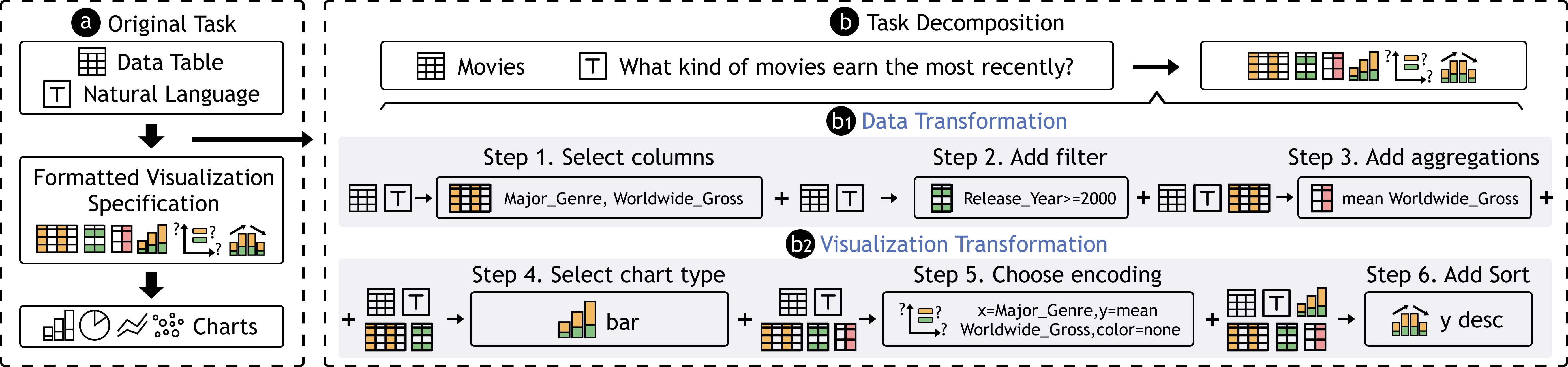
As illustrated in Figure 1a, we formulate the problem into three data stages: table data, formatted visualization specification, and visual chart. Specifically, a formatted visualization specification is a text sequence that satisfies a specific visualization grammar and can be parsed, compiled, and rendered into a visual chart. Examples include Vega-Lite [51], Vega-Zero [2], and the chart templates defined in Table2Charts [27]. We also propose a formatted template that is compatible with our method and pipeline.
Our key challenge is the transformation in the stages, that is, how to generate visualization specifications from table data based on user utterances. To address this, we decompose the process into a series of sub-tasks and formulate each sub-task as a formatted sequence-to-sequence problem, which is illustrated in Figure 1b.
3.2.1 Problem Decomposition
Inspired by grammars of graphics [52, 53, 54], we divided the process from data to formatted visualization specification into two successive transformations: data transformation and visualization transformation (Figure 1b1 and Figure 1b2). Both consist of three sub-tasks, resulting in a sequence of six sub-tasks, which are performed step-by-step.
Data transformation. Data transformation contains operations that deal with table data. Upon completion of this transformation, the transformed data is ready to be directly encoded into visual channels. Our data transformation process includes three sub-tasks: selecting the columns, filtering desired rows, and adding aggregations. First, relevant columns are selected based on the table data and user utterance, usually involving 1-3 columns. Second, table rows are filtered as needed according to the user utterance. Third, we need to aggregate the data and gain new necessary data properties (e.g., using functions such as count, average, sum, etc.).
Visualization transformation. After obtaining the transformed data, visualization transformation determines the appropriate encoding of visual channels. This process contains three sub-tasks here as well: choosing chart type, determining visual encodings, and adding optional operations. First, the model needs to infer which chart type is suitable for the selected data and aggregations based on the user utterance. Second, after selecting a chart type, the model is required to map the data fields to visual channels. Note that in this sub-task, the fields are the ones after data transformations. For example, if executing binning and counting on a specific field “a”, the fields to be encoded should be “count(binned(a))”. Third, there are possibly optional operations for the resulting charts, such as color, sorting order and bin width, etc. In this study, we primarily consider sorting by axis for simplicity.
After this six-step successive transformation process, adequate information is obtained to formulate a visualization specification. Indeed, the chart generation extends far beyond the aforementioned steps. Other design alternatives encompass factors such as color, size, bandwidth, and orientation, among others. The transformation involved in chart generation is not limited to simple filter conditions and several aggregation functions as well. These alternatives can be realized through engineering extensions, i.e., introducing additional steps or options and expanding related datasets. In this study, as a proof-of-concept system, we only take the six sub-tasks and several main design choices into consideration to simplify the problem and encourage more design alternatives to be explored in future work.
3.2.2 Answer Template for Sub-tasks
We have decomposed the problem into six sub-tasks. The next step is to model each of these sub-tasks as a sequence-to-sequence problem such that they can be solved by LMs.
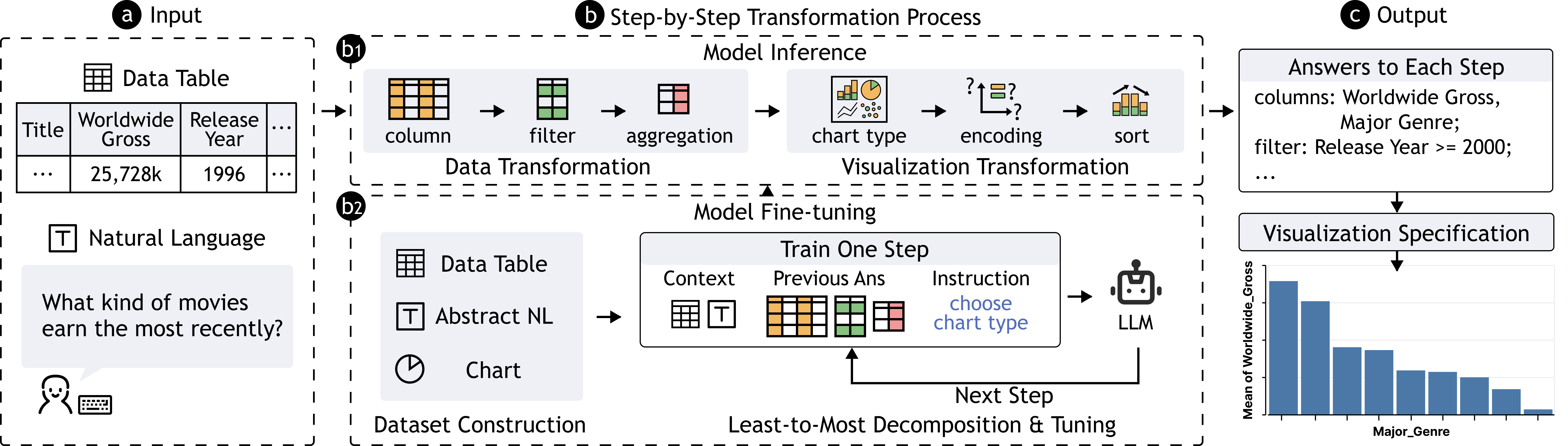
As illustrated in Figure 2, for each sub-task, the model is provided with a text sequence as input, which contains table data, user utterances, and the answers to previous sub-tasks to better aid the model in reasoning. The model will then output a text sequence as its answer to the sub-task, which is expected to meet three criteria: (1) cover all mandatory information, (2) be well-formatted to enable accurate parsing and valid specification construction, and (3) be formulated in a linear structure, as hierarchical or code structures (e.g., Vega-Lite and D3) are not appropriate for general LMs to propose. To support this, we defined a corresponding template sequence for each sub-task, as illustrated in Figure 3. Similar to Vega-Zero [2], we decomposed the workflow of chart creation into several sub-tasks.
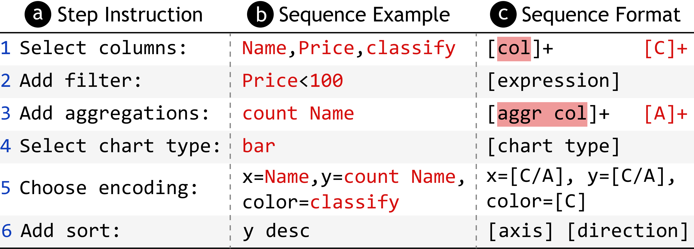
Specifically, the selected columns are represented by the header names (denoted by ‘col’) separated by commas. Filter is an expression string comprised of conditions, each of which involves a specific column and uses a predicate such as equal, greater than, and less than. These conditions are logically connected by ‘and’ / ‘or’. Aggregation functions (denoted by ‘aggr’) can be applied to some of the selected columns, represented as ‘aggr col’. Functions include count, average, sum, max, and min. Mark specifies the chart type, including bar, pie, line, and scatter. Encodings map the axes with the selected columns (C) and aggregations (A). Sort indicates which axis (x/y) to sort and in which order (desc/asc).
The model outputs the answers to each sub-task and then constructs the answers of filter, mark, encoding, and sort to generate an appropriate Vega-Lite specification. Some sub-tasks, including filter, aggregation, color encoding, and sort, may not always be necessary, and the model will output ‘None’ in these cases.
Our system covers seven types of charts commonly found in data analysis [55, 56]: bar, stacked bar, line, grouped line, scatter, grouped scatter, and pie. More complex chart types, such as radar charts and heat-maps, are not accounted for in the template. Additionally, filter and aggregate tasks also contain further design options that are not supported. In our work, we only focus on the common and basic design alternatives for each sub-task to initially validate the potential of LLMs to reason the design of visualizations.
4 ChartGPT
This section describes the approach utilized to guide the LLM’s reasoning in order to answer each sub-task. We derived an abstract NL2VIS dataset to fine-tune a large language model and generate the answers through the model. The dataset was constructed through prompting GPT-3 [7]. The details of the prompts, datasets, and model input settings are provided on https://github.com/bebinca/ChartGPT-materials.
4.1 Model Input
For a specific sub-task, since its answer is based on the whole task context and the answers of previous sub-tasks, the model input should comprise three pieces of information: (1) table data, (2) user utterance, and (3) answers to previous sub-tasks. However, for table data, it is not feasible to feed the entire table data into the model, due to the limited size of tokens that LLMs can handle. Thus, we only incorporate the column names and the top two data rows into the model input. Moreover, to compensate for the possible model cognitive bias from including partial data only, we added the type of each data column to the input to provide an overall data overview.
4.2 Reasoning Prompt and Abstract Utterances
An effective way to utilize LLM for a specific downstream task is to design a well-crafted prompt that guides the model in understanding the task target. The prompt can comprise both instructions and examples. For instance, when a task is to classify the sentiment of Tweets, the prompt may include an instruction that states “decide whether a Tweet’s sentiment is positive, neutral, or negative,” along with a few examples such as “I loved the new Batman movie! =>positive”. The model should then be able to generate a response of “negative” for “I hate chocolate.” This technique of including examples in the prompt is referred to as few-shot prompting [7]. Few-shot prompting can facilitate the model to understand the context and task, which motivated us to consider whether this technique can be applied to generate visualizations from natural language.
However, due to the flexibility of natural language, the utterances from users can be abstract for different information and on different levels. For example, in terms of information abstraction, users may omit the chart type in their utterance or refer to the data columns in vague terms, such as using “popular” to represent the column “rating” or “gross”. For level abstraction, users may concretely express their visualization requirement, such as “A pie chart showing the number of faculty members for each rank.”, which directly specifies the selected columns (rank), aggregations (count) and chart type (pie chart). On the other hand, they may also use more abstract queries, such as simply saying “show rank.” This omission of specifications can lead to multiple interpretations and reasoning paths for a particular sub-task. For instance, the choice of chart type can be determined by the selected columns (e.g., a scatter plot for two quantitative attributes) or the analytical intent of the user (e.g., a histogram for phrases like “distribution”).
The complexity of interpretation and reasoning paths makes it particularly challenging to provide sufficient examples for each sub-task within a single prompt. To assist the model in gaining a more comprehensive understanding of the interpretations of our sub-tasks, we construct a training dataset and fine-tune the model accordingly.
4.3 Dataset for Fine-tuning
4.3.1 Dataset Requirements
The dataset to fine-tune our model should consist of (data, utterance, chart) triplets. To ensure that the dataset can provide the model with sufficient knowledge, it should cover as complete interpretation paths and reasoning ways as possible. Therefore, the dataset should meet several requirements:
Various domains and types of data and charts. The table data should cover various domains to avoid overfitting to a single domain. If the domains of the dataset are too concentrated, for example, if most of the tables are related to film and television, the model may overfit to this dataset context, making it difficult to face data in other domains. In addition, the data types and chart types involved should also be comprehensive and diverse.
Different levels of information for data analysis. The natural language should be abstract for different information and on different levels, as is mentioned in subsection 4.2. It should also cover various expressions, such as the way to describe selected columns (e.g. explicit or implicit) and phrasing (e.g. command, question, or query).
Previous work about NL2VIS datasets includes Quda [57], NLV Corpus [15] and nvBench [16]. Specifically, Quda consists of 14,035 user utterance queries, covering various analytical tasks. However, no associated charts are provided. NLV Corpus collected 893 utterances involving 10 types of charts and further analyzed the features of the collected utterances, which span different expressions and abstractions. However, NLV Corpus is based on only three data tables, making it overly concentrated. The dataset from nvBench is the closest to matching our requirements, which has 25,750 (data, utterance, chart) triplets from 105 domains of table data. However, most of the utterances in nvBench are very explicit[46]. Therefore, we construct our dataset based on nvBench, which consists of utterances in different abstractions and expressions.
4.3.2 Dataset Construction
To construct a dataset based on nvBench, the main task is to maintain the diverse datasets and visual configurations and generate abstract utterances from the original triplets. For the diverse datasets maintaining, we randomly select part of the original triplets covering all domains and chart types, etc. For the abstract utterances, we generated them using GPT-3 (text-davinci-003) and involved four co-authors to check their correctness. We produce the dataset in the following process:
Charts selection. We select part of the charts in nvBench to make it compatible with our requirements. First, as nvBench contains some charts that involve multiple tables (using the ‘join’ operation) in the generation, we remove this part of the data. Second, nvBench consists of (data, utterance, chart) triplets from various domains and chart types. Moreover, nvBench categorizes these triplets into four levels of hardness, namely easy, medium, hard, and extra hard. These hardness levels reflect the complexity of chart generation. For instance, a chart that encodes three columns and requires filter, aggregation, and sort operations may be classified as extra hard. We select the charts randomly and ensure the selected data still covers all domains, hardness levels, and chart types. Instead of keeping the data of nvBench as much as possible, we selected only a portion of the charts to reduce the cost of subsequent manual operations, considering that fine-tuning LLMs requires less data than completely training a new model.
Abstract utterance generation. After selecting the charts, we use GPT-3 to automatically generate abstract utterances for each chart from its corresponding (data, utterance, chart) triplets. For each triplet, we manually design a prompt to guide GPT-3 to do this: First, we provide the top few lines of the CSV table data and describe a scenario in which we develop a tool to automatically generate charts based on user utterances and table data. Then, we give an original utterance from the triplet as an explicit utterance example. We tell the GPT-3 model that we need abstract utterances to test the tool’s performance, and require the model to generate abstract utterances based on the explicit original utterance and the table data. We also guide the model that the generated utterances should be more natural, vague, and incomplete, and can be in various phrasings.
Moreover, during the generation process, we dynamically checked the diversity of utterance generation results. For example, at first, we observed that the results tended to use many polite and verbal expressions, such as “Can you show me” (e.g., “Can you show me the amount of matches for each competition on a graph?”) or “I want to see” (e.g., “I want to see a visualization of the number of cinemas in different locations, please.”). This may be attributed to GPT-3’s interpretation of “natural” as incorporating more polite and verbal expressions. While these phrasings are commonly used, NLV Corpus demonstrates that users’ utterances are usually short queries or commands. Examples from NLV Corpus include “histogram for creative type” and “Plot IMDB rating against Rotten Tomatoes rating.” As NLV Corpus classified the majority of utterances into query, question, and command, we modified the prompts to accommodate a range of phrasings and obtained utterances without overly polite and verbal expressions such as “Budget creation trend” and “Plot capacity by opening year”. We retained the previously generated utterances and included them alongside the new additions in our final dataset.
Abstract utterance correction. The generated utterances should remain consistent with the original chart in the (data, utterance, chart) triplet from nvBench. In other words, the chart should be a reasonable answer to the utterance. As most generated abstract utterances remove or blur some information from the original utterance, some of the generated results were not consistent with the original charts. Specifically, for filters, compared to chart types and other settings that may still stay consistent with the original chart even after being removed in the utterance, utterances that remove filter information are no longer consistent with the original chart. Generally, the inconsistent data were filtered manually through three co-authors before being reviewed by another co-author. Any disagreements in the correction of the data were resolved through discussion.
Step-by-step answers generation. As our model outputs consist of the answers to the intermediate sub-tasks, we need to parse the chart configuration and extract the answers to each sub-task. We then combine the answers and the formatted template to construct the expected output of the model.
4.3.3 Dataset Statistics
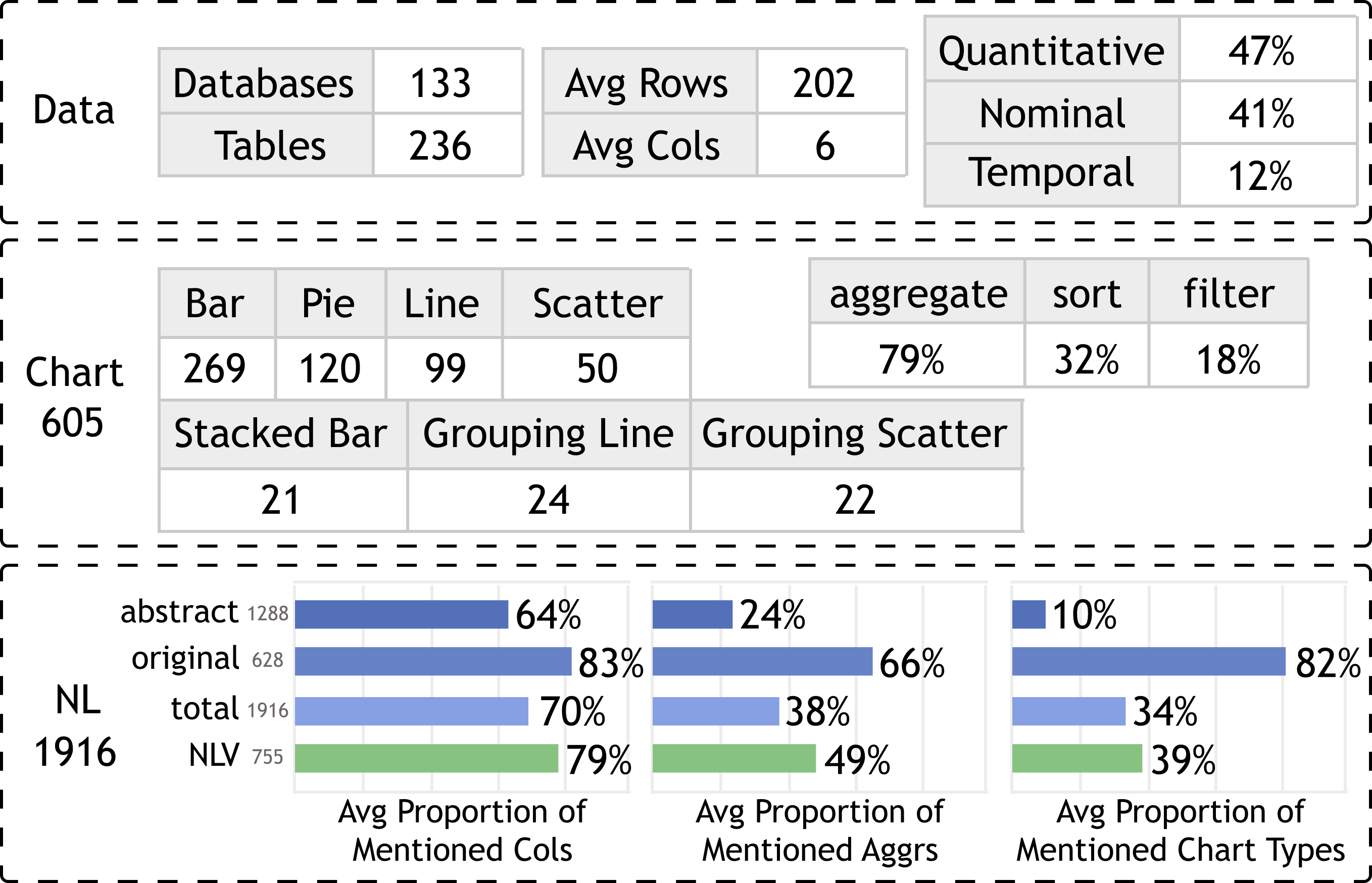
Our constructed dataset contains 1,916 (data, chart, utterance) triplets, including 236 data tables, 605 charts, and 1,916 utterances. Figure 4 illustrates the statistics of our dataset.
For data tables, our dataset contains 236 tables from 133 databases. The data tables have an average of 5 columns and 202 rows, where for all data columns, the quantitative columns account for 47%, the nominal columns account for 41%, and the temporal column account for 12%. For charts, our dataset covers seven chart types. Specifically, of all the charts, 79% involve aggregation, 32% involve sorting, and 18% involve filtering operations.
For utterances, we retained the original utterances from nvBench. The final dataset comprises a total of 1916 utterances, consisting of 1288 newly generated abstract utterances and 628 original ones. Furthermore, we compared the statistics between our dataset and the manually created dataset, NLV Corpus [15]. We quantified the frequency of explicit information related to selected columns, aggregations, and chart types mentioned in the utterances. For selected columns, we calculated the proportion of explicitly mentioned column names. For example, if a chart involved three columns, but the corresponding utterance only referred to two of them, the proportion would be 2/3. For chart types and aggregations, we examined the presence of explicit expressions, such as “bar”, “scatterplot” for chart types, and “number of”, “count” for aggregations.
The results indicate that among NLV Corpus utterances, selected columns are explicitly mentioned more frequently (79%), whereas chart types (49%) and aggregations (39%) are often omitted or vaguely expressed. The utterances from nvBench have a higher occurrence of explicit information across the board, particularly for aggregations (66%) and chart types (82%). However, after fusing with the abstract utterances generated with GPT-3, the resultant dataset exhibits a significant reduction in explicit information, particularly concerning aggregations and chart types, which closely resemble NLV Corpus. As a result, we created a dataset that looks natural and similar to the manually created ones to some extent.
In the analysis above, we focus on assessing the distribution of selected columns, aggregations, and chart types because these properties can be determined with less ambiguity, while quantifying whether the encodings, filter, and sort are explicitly mentioned involves subjective opinions of different people. To further measure the quality of our generated utterances and determine whether it is close to human-created ones, we conducted a Turing test.
4.3.4 Turing Test
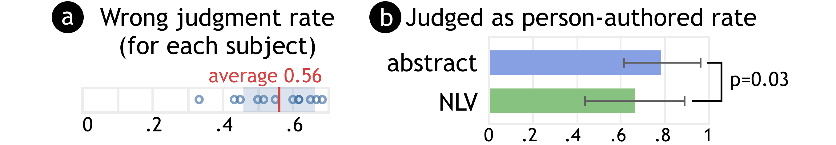
We recruited 14 subjects (7 males and 7 females, all of whom possessed experience in data analysis) to conduct a Turing test evaluating the quality of our generated utterances. We randomly selected 30 utterances from NLV Corpus across 3 tables and 30 utterances from our generated abstract utterances involving 8 tables with shuffled order. During the test, each subject was provided with an utterance alongside the corresponding table at a time. The scenario presented to the subjects was as follows: “Imagine a tool that automatically generates charts based on the table and users’ utterances. Which of the utterances below might be created by a real user?” We explicitly informed the subjects that some of the displayed utterances were human-created and some were not. Their task was to distinguish between the two categories based on two perspectives: (1) the naturalness of the phrasing and (2) the meaningfulness of the context. We hypothesized that the rate of the generated abstract utterances that are judged as human-created would be at the same level as the NLV Corpus. After the experiment, we compensated each subject with $5.
Overall results. The results revealed an average error rate of 56% (Figure 5a), with the lowest error rate recorded at 33%, suggesting that it was hard for subjects to distinguish between the GPT-generated utterances and human-created ones. Additionally, we computed the average rate () at which each utterance was judged as human-created. The overall average for all 60 samples was 0.73, indicating that subjects labeled most samples as human-created.
Comparison between generated utterances and human-created ones. Comparing the two sets, the average values for our generated abstract utterances and NLV Corpus ones were 0.79 and 0.67, respectively (Figure 5b). The corresponding standard deviation (SD) values were 0.17 and 0.23.
To evaluate the disparity, we conducted a Mann-Whitney U test, which indicated a significant difference (p = 0.03 <0.05). This result suggested that the generated utterances were even more likely to be perceived as human-created than the NLV Corpus ones. To understand this discrepancy, we examined the NLV Corpus samples with relatively lower values. One utterance stood out with a significantly lower of 0.14: “Sum(Sales) by Order Date split by Category render line asc”. This utterance is similar to captions in format, which is regarded to be less natural by most subjects. NLV Corpus itself also acknowledged that their collected utterances contain such samples whose phrasing was relatively infrequent.
4.4 Model Fine-tuning
We first divided our dataset into a training set consisting of 1,538 triplets for fine-tuning and a test set with 378 triplets (invisible to the model) for evaluation (4:1 split). Then, we fine-tuned the open-source FLAN-T5-XL model [41] with the AdamW optimizer [58] on the training set.
We selected Flan-T5 for our fine-tuning as it has undergone pre-training on various tasks, including those that involve reasoning, and possesses strong reasoning capabilities. In the process, we employed a learning rate of 1e-4, a global batch size of 16, and trained for five epochs. Generally, the trained model obtains an evaluation loss of 0.05. These parameters are chosen based on the model document 111https://huggingface.co/docs/transformers/model_doc/t5, trial and error, and the capacity of our computational resources. We show the evaluation results in section 6.
5 Interface
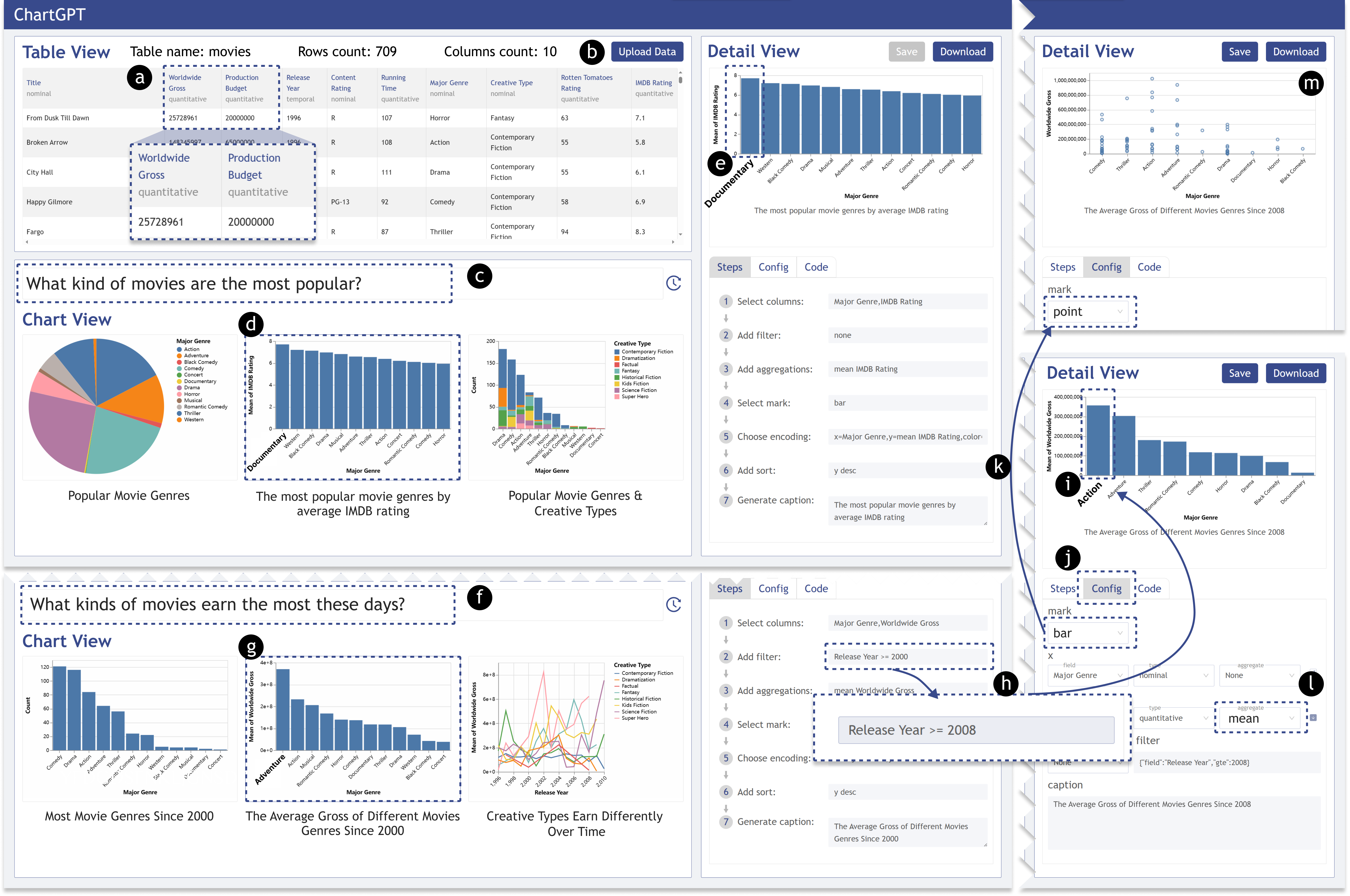
We have developed an interface with three views: table view, chart view, and detail view. In this section, we present the features of our interface through a usage scenario based on a movie dataset.
To begin, the user uploads the CSV file (Figure 6b). The tabular data will be displayed with the type of each column, including nominal, quantitative, or temporal. The user then quickly navigates through the table headers and their types and relevant data. S/he notices that the movie data table contains ten columns and 709 rows, each row providing detailed information about a particular movie.
The user wants to know “what kind of movies are the most popular?” and enters this question into the search box (Figure 6c). ChartGPT then returns the top three charts based on the input. The user observes that the first and the third charts display the number of movies by genre and creative types, respectively, and the second chart shows the average IMDB rating of each genre. The user is interested in the second one (Figure 6d) and understands that the movie genre with the highest average IMDB rating is Documentary.
In addition to the count and ratings, the user further notes that the data contains information on gross and budget (Figure 6a). The user changes the input to “What kinds of movies earn the most these days?” (Figure 6f). The results update, and the second and the third charts are about worldwide gross. The user investigates the charts and checks the details in the detail view. The user observes that the second chart (Figure 6g) has a filter condition of “Release Year >= 2000”, which corresponds to the utterance “recently”.
The user is not fully satisfied with the filtering condition and expects more recent movies. S/he turns to the detail view and changes the condition to “Release Year >= 2008” and regenerates the result from step 3 (Figure 6h). After re-rendering, the user discovers that the genre with the highest average gross since 2008 is the action movie (Figure 6i). Furthermore, the user wants to see the distribution of movies for each genre. Therefore, the user switches to the config mode (Figure 6j) in the detail view. The user changes the mark type to “point” (Figure 6k) and removes the aggregation of the y-axis (Figure 6l), resulting in a scatter plot that meets the needs (Figure 6m).
6 Evaluation
This section introduces a comparative evaluation of ChartGPT with NL4DV and ncNet and a usability study on the ChartGPT interface.
6.1 Evaluation Setup
We used our test set derived in subsection 4.4 to evaluate the performance of ChartGPT, NL4DV, and ncNet. As both our system and NL4DV can return more than one result, we reported the top-1 and top-3 results for these two methods and reported the top-1 result for ncNet. However, please note that the design spaces of the three methods are also slightly different from each other. For example, NL4DV supports boxplots and tick charts but doesn’t support pie charts. For fairness, we only compared results that can be produced by all methods. For the test data with configurations in our design space that NL4DV does not support, we didn’t introduce them into the result statistics either.
6.2 Evaluation Metrics
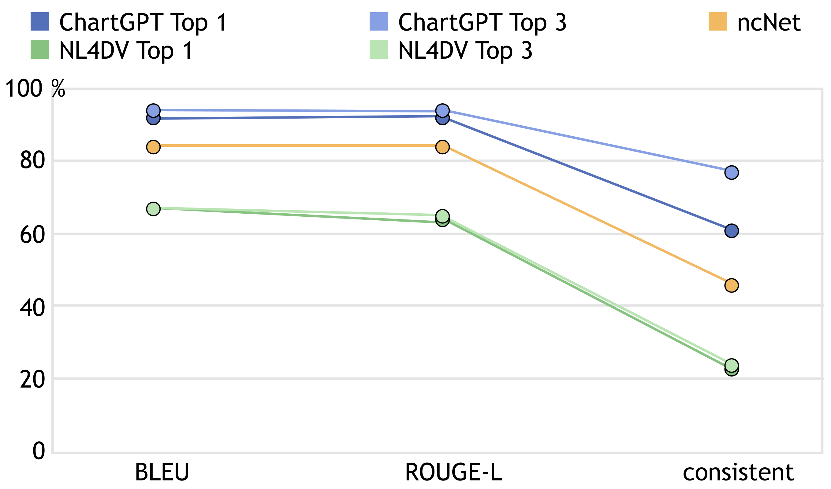
We measured two metrics: consistency and similarity. Consistency is used to count how many results the system produces that are exactly the same as the ground truth. In addition, because our inputs are abstract and may cause ambiguity, we further accounted for how similar the results are to the ground truth. We hypothesized that even if the input is ambiguous and can correspond to multiple correct answers, these answers are also to some extent similar to ground truth. Therefore, we used the degree of similarity to further measure the ability of the system to handle abstract natural language.
Consistency Metrics. We define a result as “consistent” if the result is identical to the ground truth. Further, in our scenario, “identical” means identical in all supported design alternatives, i.e., mark, encoding, aggregation, sort, and filter are identical. In addition, we consider two scatter plots with x and y reversed as consistent as well, as they still point to equivalent results [15].
Similarity Metrics. We define the “similarity” of a result as the degree to which it is similar to the ground truth in terms of comprehensive design alternatives. We converted the ground truth and results of different methods into equal-length word sequences, and then compared the similarity of the sequences. In particular, we defined the format of sequence as an 8-words sequence, i.e., [mark] [x field] [x aggregation] [y field] [y aggregation] [color field] [filter] [sort], and each part is a single word. Then, we measured the ROUGH-L [59] and BLEU [60] metrics between the results and the ground truth. ROUGH-L calculates the similarity between two sequences based on the length of the longest common subsequence (LCS). This value is affected by both the value and order of words. Under this metric, if the selected fields and aggregations in both the ground truth and the model result are the same but encoded on different axes, the score will reduce. We suppose that charts with the same selected fields and aggregations but mapped to different axes from the ground truth are still acceptable when compared to the ones with inappropriate encodings. Therefore, as a complement to the ROUGE-L, we tested the models with the BLEU score, which allows the model to switch the order of some encoded fields.
Specifically, before converting into a sequence, we first verify whether the result is related to the input data table and can be parsed properly into Vega-Lite code format. For example, if the result contains a column name that is not in the table, then the result is not valid. After parsing the result into Vega-Lite and displaying it, it will report an error or display it as undefined because it cannot find the corresponding data. We marked the similarity and consistency of such results as zero.
6.3 Evaluation Results
Our evaluation results are presented in Figure 7, which showcases the top-1 and top-3 reviews of ChartGPT, ncNet, and NL4DV. The results indicate that ChartGPT outperforms the other two models in terms of both the consistency metric and similarity metric, with its top-1 and top-3 reviews scoring higher than those of ncNet and NL4DV.
Comparison with the baselines. Looking through the tested cases, there are two key factors that account for the differences between the approaches: One is semantic understanding. ChartGPT has a better parsing of the semantic information of the table headers and utterances. Examples include inferring the column “sex” from “male and female”, column “age” from “how old”, and inferring a temporal column and count aggregation from “when create the most departments”. The other is omitted information. Abstract utterances often omit information such as aggregation and chart types, which requires the capability of reasoning the visualization specifications. ChartGPT is based on Flan-T5, which is previously fine-tuned on chain-of-thought (CoT) reasoning tasks and is further fine-tuned by us on visualization datasets in a CoT way, so that it may have a better reasoning capability of omitted information.
Metric difference analysis. The consistency metric is drastically lower when compared to the other two metrics, which is possibly due to two factors. First, ambiguity in abstract utterances often results in multiple reasonable answers. For instance, consider the abstract utterance “How many documents are at each location? ” from the original utterance “Show the number of documents for each location code in a pie chart”. This abstraction removes the chart-type information, making a bar chart also a reasonable response. Second, partial correct inferences occur when the model misses some subtle yet critical to chart expressiveness information. For example, the model may correctly extract the needed columns but give wrong aggregations, or miss the filter and sort conditions.
7 User Study
We derived a comparative study and a usability study to evaluate ChartGPT further. Through the user studies, we want to (1) compare the results of ChartGPT with the two baseline methods from users’ perspective, and (2) evaluate the usability of ChartGPT.
7.1 Comparative Study
In this study, we recruited 12 subjects (6 males and 6 females, all of whom possessed experience in generating data visualization) to conduct a comparative study evaluating the quality of generated charts from different approaches (ChartGPT, ncNet, and NL4DV). None of them has the experience of using the approaches above.
Tasks and Data. We sampled 15 utterances from the test dataset, corresponding to 13 data tables and 42 charts generated from NL4DV (top-1), ncNet, and ChartGPT (top-1). Subjects were presented with the tables, utterances, and generated charts in random order, then they were required to compare and rank the quality of charts, deciding which charts are more reasonable outputs for the table and utterances based on their preferences. If a chart makes no sense in their opinion, it won’t be included in the ranking. The sampling is based on two steps. First, we selected the tables that are close to common sense, to ensure that subjects can understand the table context. Second, we selected the abstract utterances from the selected tables, and ensured that (1) the utterances are in various abstractions and phrasings and (2) the chart types are all included.
Procedure. The entire experiment lasted about 10-25 minutes. First, subjects were introduced to the background of natural language interfaces for generating data visualizations for 3 minutes. Then, they began to compare and rank the quality of generated charts based on the provided data table and utterances. Subjects were required to ensure that they understood the contents of the data table and utterances before performing the actions. They were allowed to ask about the meaning of the data table, utterance, or a particular legend in the chart, but had to rank the charts entirely according to their own ideas and preferences. After the experiment, we compensated each subject with $5.
Results. We counted the ranking results of the subjects. Specifically, for the user’s ranking of the charts corresponding to a particular utterance, we normalized the rankings into scores from 0 to 3, with the first ranking scored as 3 and the charts that did not appear in the ranking scored as 0. Additionally, we calculated the proportion that each approach was first-ranked. We used a Friedman Test to examine whether there exists a significant difference across the approaches, and a post hoc Wilcoxon test to compare the pair-groups.
The results showed both significant differences in the case of the ranking score (=8.00, p 0.05) and first-ranked proportion (=17.64, p 0.001). Overall, ChartGPT had the best performance (i.e. the higher ranking score and first-ranked proportion on average, p 0.05). The results are illustrated in Figure 8.

7.2 Usability Study

7.2.1 Experiment Settings
Participants. We recruited 12 subjects (S1-S12, 6 males and 6 females) from different departments, including Computer Science (3), Sports Science (2), Digital Media Design (2), Urban Informatics (1), Industrial Design (1), Geographic Information Science (1), Agricultural Engineering (1) and Corporate Finance (1). Most subjects were familiar with data visualization charts, with an average self-reported score of 3.4 on a 5-point Likert Scale. All subjects had experience using tools to author data charts, including Microsoft Excel, Vega-Lite, D3.js, G2, ECharts, and Matplotlib. In addition, all of them had experience in using natural language interfaces (including ChatGPT) and scientific English writing.
Tasks and Data. Subjects were provided with two data tables (movies and cars) and were required to choose the one that they were more familiar with or more interested in. They were required to explore the selected data with ChartGPT and create at least four desired charts based on natural language inputs. During the creation process, if the default generated chart did not match their desires, subjects could rephrase their input words, modify the answers to the steps and regenerate the results, or modify the chart configuration directly to get the desired chart. However, if subjects could not get the desired chart no matter what action they took, or if the chart they wanted was not supported by ChartGPT, they could give up the intent and try to generate another new desired chart. In total, the created charts should contain at least two chart types, involving at least three different columns of data. Both the movies and cars data come from NLV Corpus [15], and have more than 9 columns and 300 rows, involving all three types of values (temporal, nominal, and quantitative). We chose these two data tables as their context is close to common sense and is easy to understand.
Procedure. The entire experiment lasted about 20-35 minutes. Subjects were first required to select a data table they were more interested in and familiar with from movie and car datasets. We ensured that subjects could understand the dataset before the next process. Subjects were then introduced to the functions and interactions of the chartGPT system. During the introduction, we did not provide the subjects with any concrete input examples to avoid influencing their way of organizing language. Instead, we encouraged users from this stage to think of anything as input themselves and introduced the interface and interactions along the way. After the introduction, subjects began to create their desired charts with their selected data. All inputs and actions taken by subjects are recorded. Finally, after finishing the task, we interviewed the subjects to collect their feedback about ChartGPT. After the experiment, we compensated each subject with $10.
7.2.2 Quantitative Results
The results of the usability study are illustrated in Figure 9, and the corresponding statistics are presented in Figure 9b. A total of 53 historical logs were collected from the subjects, and 49 of them resulted in successfully generated charts. The other 4 failed logs indicated that the subjects could not obtain a satisfactory chart, thus giving up the input and began to generate a different chart. These successfully generated charts were further classified into three categories based on the actions that the subjects performed to obtain them: (i) obtained on the first attempt, (ii) obtained after adjusting step or config settings, and (iii) obtained after rephrasing the input utterance.
Nearly half of the charts (23 out of 49, 47%) were obtained on the first attempt. There were 13 cases where the subjects made adjustments to the step or config settings and 13 cases rephrased their input statements. However, such adjustments did not necessarily imply that the system-generated results did not match their input. In fact, the input and the system-generated chart were consistent for all adjusting step and config cases and most of the rephrasing cases. Nonetheless, some participants wanted to experiment with further adjustments based on their own ideas after viewing the initial chart. Therefore, we further counted the number of cases where the system-generated chart and user input matched among the rephrasing cases (10 out of 13). In the remaining three cases, the participants attempted to rephrase their input statements once, twice, and thrice, respectively, until they obtained a satisfactory result that matched their input.
Out of the four failed inputs, three of them involved data transformations or visual encodings that were not supported by the system, such as dividing gross by budget or displaying two bar charts side by side in a single result. The remaining input could not produce a valid chart as the provided encoding was self-contradictory (attempting to encode two data fields on the x-axis).
7.2.3 Qualitative Feedback
The system’s ability to respond to incomplete intent streamlines the thought process and enables users to explore data from the shallow to the deep. Most users have involved some input with incomplete intent in using the system. Instead of indicating that they want to look at trends, distributions, or relationships, these inputs tend to refer only to the columns of data they are interested in, such as “show some charts about major genre” from S7 (left in Figure 9a1). S7 notes that “When I first started looking at the data table, I only have an initial interest in certain data columns (e.g. major genre).” This allows them to give input once they have an initial idea and observe the system’s response. S6 further mentioned, “I only need to do one short step of thinking before viewing the relevant results, while when using other tools I often have to carefully define my intentions from vague to explicit first. ” In addition, some subjects used the results from incomplete input to gain an understanding of the data, draw connections, and develop further inputs. For example, as is illustrated in Figure 9a2, after entering “show horsepower” and seeing the results, S12 became interested in “miles per gallon” and entered “describe horsepower and gallon”. Further, she wanted to focus on Japanese cars and typed “show me the information about Japanese models related to gallon and horsepower” and obtained the desired result finally. As such, the system’s ability to answer abstract requests that don’t articulate a complete intention shortens the thought process needed for every single round of interaction, enabling users to explore the data from the shallow to the deep.
ChartGPT supports a semantic understanding of the visual intent, allowing users to express themselves flexibly and naturally. Some of our subjects have involved inputs that can not match the corresponding data columns directly. For example, when S6 entered “which type of movies earn most”, the system was able to understand the keywords ‘type’ and ‘earn’ and infer the Major Genre and Worldwide Gross columns (middle in Figure 9a1). Specifically, our system returned the highest worldwide gross for each major genre. Moreover, this semantic inference is not restricted to word-for-word, or just maps the keywords directly, but is a general understanding. For example, on S8’s input of “number of movies over time”, the system was able to determine that the ‘Release Year’ column may be a more appropriate choice than ‘Running Time’. In this regard, about half of our subjects commented that the system is “smart” as it has some semantic inference ability and good support for natural language flexibility. Specifically, S2 praised its “flexible semantic associations” which alleviates his burden of perfecting their language to be more precise for the system. In general, the semantic understanding of natural language in our system facilitates a more user-friendly experience as it reduces the need to be exact in users’ phrasing and organization while inputting text.
The interaction to modify the results of intermediate steps can shorten the distance between the system-generated and user-desired results. Despite the majority of subjects recognizing chartGPT’s ability to understand semantic natural language and produce accurate results, due to user preferences and the ambiguity of the user’s natural language, the generated results sometimes adhered to their expressions, yet did not yield their desired outcome in some parts. For instance, S3 initially entered “show the relationship between worldwide gross and rotten tomatoes rating”, and obtained a scatter plot between the two mentioned columns. However, she thought that this chart is with too many points and wanted to focus on comedy movies, so she added the condition “Major Genre = ‘Comedy”’ to the filter step and regenerated the results (middle in Figure 9a3). S3 commented “I can regenerate results from the middle without having to reformulate my original input when I have a clear intent to target a particular step. ” Overall, 10 out of our 12 subjects have employed modifications of the steps or configurations according to their preferences. S2 further pointed out that after seeing the initial results generated by the system, it is simple to determine if its details match his preferences, resulting in a “clear direction for modification”.
8 Discussion
This section includes the implications, lessons learned, limitations, and future work of our system.
8.1 Implications
In terms of technique, our proposed framework employs LLMs for generating charts from abstract utterances using a “decomposition and fine-tune” approach that involves a limited-size dataset. We demonstrate its effectiveness through both quantitative evaluations and a user study. In terms of evaluation, we contribute a dataset of abstract utterances and corresponding charts generated using LLMs. This dataset can serve as a benchmark for future research and training data for machine learning studies. Additionally, our method of constructing the dataset from LLMs and using it to fine-tune LLMs is significant. In terms of applicability, our framework’s applicability extends beyond NL2VIS generation, as it can be used to solve complex downstream tasks that LLMs cannot directly handle. For instance, long story writing can also be decomposed into several sub-modules, from planning the characters and outline to drafting and editing the story continuation [61]. The feedback from these experiments provides valuable insights into the potential applications of LLMs in generating visualizations, inspiring further research in this field.
8.2 Lessons Learned
Modification is important to suit different preferences. Users have varying preferences for chart design choices and may not always follow a consistent design rule. During our data collection, most of the data we collated tended to follow common design principles, such as using scatter plots for two quantitative data columns and line charts for displaying trends over time. However, our user study revealed that users’ preferences were not always consistent. For instance, when aggregation was not specified explicitly in the utterances, some subjects preferred to average data while others preferred to look at the maximum value. Additionally, during the free exploration task, some subjects switched from a scatter plot displaying two quantitative data columns to a line graph or from a line graph showing trends over time to a bar graph. This underscores the importance of providing users with interactions to modify or fine-tune the results in the authoring tool to facilitate human-in-the-loop, as the generated results are not guaranteed to always match everyone’s preferences.
8.3 Limitations and Future Work
Support for larger scope. Currently, ChartGPT only supports some key chart components and design choices for chart generation, with an aim to demonstrate the usefulness of our framework. First, additional transformations and visualization parameters could be considered. The transformation supports such as density, extend, and pivot can be covered by extending our decomposition steps. The parameters, such as mark types and visual channels, can be extended by enlarging our dataset. Second, supporting follow-up utterances to modify the generated charts is also an intuitive manner for human-LLM interaction. To achieve this, we can train an LLM with existing specifications and the modification command as input and generate an updated specification. It requires the construction of the dataset, which can also be attained with the help of ChatGPT. Third, as an LLM for a specific domain, it is required to recognize out-of-domain queries and raise warnings. To do so, we can add an additional boolean token representing whether the utterance is related to the input data and visual analysis. Negative examples can be generated and mixed up with our proposed dataset.
Scalability for large datasets. We constructed the model input by the table header, column types, two data rows, and user utterance, so the number of columns in the table would affect the prompt length. For our dataset, we trained the model with a maximum prompt length of 582 input tokens. To accommodate the datasets exceeding this size, there are two potential improvements: (a) Reconfigure the model input to reduce the token count. For example, selectively include columns or values that are most relevant to the user’s utterance. We can improve the data selection strategy for a more effective dataset view, including both dataset insight mining and natural language understanding. (b) Expand our training dataset and allocate additional computational resources to accommodate longer prompts.
Inspiration v.s. accuracy. ChartGPT aims to accurately capture the intent from the user’s abstract natural language and make reasonable inferences. Therefore, our system tends to prioritize the accuracy of the results by presenting the most relevant information first and providing optional charts later. Our dataset also reflects this tendency. When an utterance involves only a certain data column and lacks other analytical intent, our ground truth is often to show the distribution of the column, which is the most closely related to the utterance’s information.
Despite this emphasis on accuracy, user feedback has indicated that it is not always the primary concern. For example, during the comparing and ranking task, for the utterance “show something about origin”, some of our subjects preferred the chart showing the origin and other data fields. Similarly, during the free exploring stage, three subjects suggested that they would like to see content that could inspire them beyond the scope of their utterances. Two of them specifically emphasized that this need was not consistent all the time. In response to this feedback, we plan to propose an option for users to specify their desired level of inspiration (e.g., “high inspiration” versus “accuracy only”) in their query in the future. This allows the system to better match users’ needs and enhance their experience.
Flexibility v.s. certainty. Our system was able to accommodate a wide range of user intentions, but limitations arose when users expressed intentions beyond the current capabilities of the system. During our study, we observed two subjects attempting to explore data using intentions that were not supported by the system. One of the subjects expressed an intention that could not be drawn as a chart, while the other wanted to do a data transformation in which two columns in a table were computed, e.g., gross divided by budget. In such cases, our system still produced results, which unfortunately did not align with their intentions. However, it took the subjects quite some time to evaluate and finally realize that the system did not support their intentions after adjusting their inputs several times. While our design space could be expanded to accommodate more needs, the flexibility of natural language and the definite design space of the system mean that the system’s capability is limited to support the full range of natural language expressions, leading to confusion for users about which inputs will lead to successful chart results. Future work could explore enhancing the system’s ability to recognize the inputs that are beyond its supported range more intelligently and intuitively.
9 Conclusion
This paper introduces ChartGPT, leveraging LLMs to generate charts from abstract utterances. We formulate the chart-generation problem as a sequential reasoning tasks and construct an abstract utterance dataset to fine-tune a language model for solving each task. Furthermore, we design an interactive interface for ChartGPT to enable users to examine and modify intermediate outputs. The effectiveness of the proposed system is evaluated through a comparative study and a usability study.
References
- [1] A. Narechania, A. Srinivasan, and J. Stasko, “Nl4dv: A toolkit for generating analytic specifications for data visualization from natural language queries,” IEEE Transactions on Visualization and Computer Graphics, vol. 27, no. 2, pp. 369–379, 2020.
- [2] Y. Luo, N. Tang, G. Li, J. Tang, C. Chai, and X. Qin, “Natural language to visualization by neural machine translation,” IEEE Transactions on Visualization and Computer Graphics, vol. 28, no. 1, pp. 217–226, 2021.
- [3] Tableau Software, “Tableau,” https://www.tableau.com/, 2003.
- [4] V. Setlur, M. Tory, and A. Djalali, “Inferencing underspecified natural language utterances in visual analysis,” in Proceedings of the 24th International Conference on Intelligent User Interfaces, 2019, pp. 40–51.
- [5] A. Wu, Y. Wang, X. Shu, D. Moritz, W. Cui, H. Zhang, D. Zhang, and H. Qu, “Ai4vis: Survey on artificial intelligence approaches for data visualization,” IEEE Transactions on Visualization and Computer Graphics, 2021.
- [6] J. Devlin, M.-W. Chang, K. Lee, and K. Toutanova, “Bert: Pre-training of deep bidirectional transformers for language understanding,” arXiv preprint arXiv:1810.04805, 2018.
- [7] T. Brown, B. Mann, N. Ryder, M. Subbiah, J. D. Kaplan, P. Dhariwal, A. Neelakantan, P. Shyam, G. Sastry, A. Askell et al., “Language models are few-shot learners,” Advances in neural information processing systems, vol. 33, pp. 1877–1901, 2020.
- [8] OpenAI, “Introducing chatgpt,” https://openai.com/blog/chatgpt, November 2022.
- [9] J. Wei, Y. Tay, R. Bommasani, C. Raffel, B. Zoph, S. Borgeaud, D. Yogatama, M. Bosma, D. Zhou, D. Metzler et al., “Emergent abilities of large language models,” arXiv preprint arXiv:2206.07682, 2022.
- [10] M. Chen, J. Tworek, H. Jun, Q. Yuan, H. P. d. O. Pinto, J. Kaplan, H. Edwards, Y. Burda, N. Joseph, G. Brockman et al., “Evaluating large language models trained on code,” arXiv preprint arXiv:2107.03374, 2021.
- [11] J. J. Y. Chung, W. Kim, K. M. Yoo, H. Lee, E. Adar, and M. Chang, “Talebrush: sketching stories with generative pretrained language models,” in Proceedings of the 2022 CHI Conference on Human Factors in Computing Systems, 2022, pp. 1–19.
- [12] T. S. Kim, D. Choi, Y. Choi, and J. Kim, “Stylette: Styling the web with natural language,” in Proceedings of the 2022 CHI Conference on Human Factors in Computing Systems, 2022, pp. 1–17.
- [13] S. Welleck, I. Kulikov, S. Roller, E. Dinan, K. Cho, and J. Weston, “Neural text generation with unlikelihood training,” arXiv preprint arXiv:1908.04319, 2019.
- [14] D. Zhou, N. Schärli, L. Hou, J. Wei, N. Scales, X. Wang, D. Schuurmans, O. Bousquet, Q. Le, and E. Chi, “Least-to-most prompting enables complex reasoning in large language models,” arXiv preprint arXiv:2205.10625, 2022.
- [15] A. Srinivasan, N. Nyapathy, B. Lee, S. M. Drucker, and J. Stasko, “Collecting and characterizing natural language utterances for specifying data visualizations,” in Proceedings of the 2021 CHI Conference on Human Factors in Computing Systems, 2021, pp. 1–10.
- [16] Y. Luo, N. Tang, G. Li, C. Chai, W. Li, and X. Qin, “Synthesizing natural language to visualization (nl2vis) benchmarks from nl2sql benchmarks,” in Proceedings of the 2021 International Conference on Management of Data, 2021, pp. 1235–1247.
- [17] X. Qin, Y. Luo, N. Tang, and G. Li, “Making data visualization more efficient and effective: a survey,” The VLDB Journal, vol. 29, pp. 93–117, 2020.
- [18] B. Saket, D. Moritz, H. Lin, V. Dibia, C. Demiralp, and J. Heer, “Beyond heuristics: Learning visualization design,” arXiv preprint arXiv:1807.06641, 2018.
- [19] J. Mackinlay, “Automating the design of graphical presentations of relational information,” Acm Transactions On Graphics (Tog), vol. 5, no. 2, pp. 110–141, 1986.
- [20] J. Mackinlay, P. Hanrahan, and C. Stolte, “Show me: Automatic presentation for visual analysis,” IEEE transactions on visualization and computer graphics, vol. 13, no. 6, pp. 1137–1144, 2007.
- [21] K. Wongsuphasawat, D. Moritz, A. Anand, J. Mackinlay, B. Howe, and J. Heer, “Towards a general-purpose query language for visualization recommendation,” in Proceedings of the Workshop on Human-In-the-Loop Data Analytics, 2016, pp. 1–6.
- [22] Wongsuphasawat, Kanit and Moritz, Dominik and Anand, Anushka and Mackinlay, Jock and Howe, Bill and Heer, Jeffrey, “Voyager: Exploratory analysis via faceted browsing of visualization recommendations,” IEEE transactions on visualization and computer graphics, vol. 22, no. 1, pp. 649–658, 2015.
- [23] K. Wongsuphasawat, Z. Qu, D. Moritz, R. Chang, F. Ouk, A. Anand, J. Mackinlay, B. Howe, and J. Heer, “Voyager 2: Augmenting visual analysis with partial view specifications,” in Proceedings of the 2017 chi conference on human factors in computing systems, 2017, pp. 2648–2659.
- [24] D. Moritz, C. Wang, G. L. Nelson, H. Lin, A. M. Smith, B. Howe, and J. Heer, “Formalizing visualization design knowledge as constraints: Actionable and extensible models in draco,” IEEE transactions on visualization and computer graphics, vol. 25, no. 1, pp. 438–448, 2018.
- [25] Y. Luo, X. Qin, N. Tang, and G. Li, “Deepeye: Towards automatic data visualization,” in 2018 IEEE 34th international conference on data engineering (ICDE). IEEE, 2018, pp. 101–112.
- [26] V. Dibia and Ç. Demiralp, “Data2vis: Automatic generation of data visualizations using sequence-to-sequence recurrent neural networks,” IEEE computer graphics and applications, vol. 39, no. 5, pp. 33–46, 2019.
- [27] M. Zhou, Q. Li, X. He, Y. Li, Y. Liu, W. Ji, S. Han, Y. Chen, D. Jiang, and D. Zhang, “Table2charts: recommending charts by learning shared table representations,” in Proceedings of the 27th ACM SIGKDD Conference on Knowledge Discovery & Data Mining, 2021, pp. 2389–2399.
- [28] H. Li, Y. Wang, S. Zhang, Y. Song, and H. Qu, “Kg4vis: A knowledge graph-based approach for visualization recommendation,” IEEE Transactions on Visualization and Computer Graphics, vol. 28, no. 1, pp. 195–205, 2021.
- [29] A. Wu, Y. Wang, M. Zhou, X. He, H. Zhang, H. Qu, and D. Zhang, “MultiVision: Designing analytical dashboards with deep learning based recommendation,” IEEE Transaction on Visualization and Computer Graphics, vol. 28, no. 1, pp. 162–172, 2022.
- [30] D. Deng, A. Wu, H. Qu, and Y. Wu, “DashBot: Insight-driven dashboard generation based on deep reinforcement learning,” IEEE Transaction on Visualization and Computer Graphics, vol. 29, no. 1, pp. 690–700, 2023.
- [31] L. Shen, E. Shen, Y. Luo, X. Yang, X. Hu, X. Zhang, Z. Tai, and J. Wang, “Towards natural language interfaces for data visualization: A survey,” CoRR, vol. abs/2109.03506, 2021.
- [32] H. Voigt, Ö. Alaçam, M. Meuschke, K. Lawonn, and S. Zarrieß, “The why and the how: A survey on natural language interaction in visualization,” in Proceedings of the Conference of the North American Chapter of the Association for Computational Linguistics: Human Language Technologies, M. Carpuat, M. de Marneffe, and I. V. M. Ruíz, Eds., 2022, pp. 348–374.
- [33] R. Chen, X. Shu, J. Chen, D. Weng, J. Tang, S. Fu, and Y. Wu, “Nebula: A coordinating grammar of graphics,” IEEE Transactions on Visualization and Computer Graphics, vol. 28, no. 12, pp. 4127–4140, 2021.
- [34] Y. Sun, J. Leigh, A. Johnson, and S. Lee, “Articulate: A semi-automated model for translating natural language queries into meaningful visualizations,” in Smart Graphics: 10th International Symposium on Smart Graphics, Banff, Canada, June 24-26, 2010 Proceedings 10. Springer, 2010, pp. 184–195.
- [35] T. Gao, M. Dontcheva, E. Adar, Z. Liu, and K. G. Karahalios, “Datatone: Managing ambiguity in natural language interfaces for data visualization,” in Proceedings of the 28th annual acm symposium on user interface software & technology, 2015, pp. 489–500.
- [36] B. Yu and C. T. Silva, “Flowsense: A natural language interface for visual data exploration within a dataflow system,” IEEE transactions on visualization and computer graphics, vol. 26, no. 1, pp. 1–11, 2019.
- [37] V. Setlur, S. E. Battersby, M. Tory, R. Gossweiler, and A. X. Chang, “Eviza: A natural language interface for visual analysis,” in Proceedings of the 29th annual symposium on user interface software and technology, 2016, pp. 365–377.
- [38] E. Hoque, V. Setlur, M. Tory, and I. Dykeman, “Applying pragmatics principles for interaction with visual analytics,” IEEE transactions on visualization and computer graphics, vol. 24, no. 1, pp. 309–318, 2017.
- [39] P. Hanrahan, “Vizql: a language for query, analysis and visualization,” in Proceedings of the 2006 ACM SIGMOD international conference on Management of data, 2006, pp. 721–721.
- [40] OpenAI, “Gpt-4 technical report,” 2023.
- [41] H. W. Chung, L. Hou, S. Longpre, B. Zoph, Y. Tay, W. Fedus, E. Li, X. Wang, M. Dehghani, S. Brahma, A. Webson, S. S. Gu, Z. Dai, M. Suzgun, X. Chen, A. Chowdhery, S. Narang, G. Mishra, A. Yu, V. Zhao, Y. Huang, A. Dai, H. Yu, S. Petrov, E. H. Chi, J. Dean, J. Devlin, A. Roberts, D. Zhou, Q. V. Le, and J. Wei, “Scaling instruction-finetuned language models,” 2022.
- [42] H. Touvron, T. Lavril, G. Izacard, X. Martinet, M.-A. Lachaux, T. Lacroix, B. Rozière, N. Goyal, E. Hambro, F. Azhar, A. Rodriguez, A. Joulin, E. Grave, and G. Lample, “LLaMA: Open and efficient foundation language models,” 2023.
- [43] H. Touvron, L. Martin, K. Stone, P. Albert, A. Almahairi, Y. Babaei, N. Bashlykov, S. Batra, P. Bhargava, S. Bhosale, D. Bikel, L. Blecher, C. C. Ferrer, M. Chen, G. Cucurull, D. Esiobu, J. Fernandes, J. Fu, W. Fu, B. Fuller, C. Gao, V. Goswami, N. Goyal, A. Hartshorn, S. Hosseini, R. Hou, H. Inan, M. Kardas, V. Kerkez, M. Khabsa, I. Kloumann, A. Korenev, P. S. Koura, M.-A. Lachaux, T. Lavril, J. Lee, D. Liskovich, Y. Lu, Y. Mao, X. Martinet, T. Mihaylov, P. Mishra, I. Molybog, Y. Nie, A. Poulton, J. Reizenstein, R. Rungta, K. Saladi, A. Schelten, R. Silva, E. M. Smith, R. Subramanian, X. E. Tan, B. Tang, R. Taylor, A. Williams, J. X. Kuan, P. Xu, Z. Yan, I. Zarov, Y. Zhang, A. Fan, M. Kambadur, S. Narang, A. Rodriguez, R. Stojnic, S. Edunov, and T. Scialom, “Llama 2: Open foundation and fine-tuned chat models,” 2023.
- [44] P. Maddigan and T. Susnjak, “Chat2vis: Generating data visualisations via natural language using chatgpt, codex and gpt-3 large language models,” IEEE Access, 2023.
- [45] V. Dibia, “Lida: A tool for automatic generation of grammar-agnostic visualizations and infographics using large language models,” March 2023.
- [46] L. Cheng, X. Li, and L. Bing, “Is gpt-4 a good data analyst?” arXiv preprint arXiv:2305.15038, 2023.
- [47] W. Zhang, Y. Shen, W. Lu, and Y. Zhuang, “Data-copilot: Bridging billions of data and humans with autonomous workflow,” 2023.
- [48] J. Wei, X. Wang, D. Schuurmans, M. Bosma, E. Chi, Q. Le, and D. Zhou, “Chain of thought prompting elicits reasoning in large language models,” arXiv preprint arXiv:2201.11903, 2022.
- [49] E. H.-h. Chi, “A taxonomy of visualization techniques using the data state reference model,” in IEEE Symposium on Information Visualization 2000. INFOVIS 2000. Proceedings. IEEE, 2000, pp. 69–75.
- [50] M. Card, Readings in information visualization: using vision to think. Morgan Kaufmann, 1999.
- [51] A. Satyanarayan, D. Moritz, K. Wongsuphasawat, and J. Heer, “Vega-lite: A grammar of interactive graphics,” IEEE Trans. Visualization & Comp. Graphics (Proc. InfoVis), 2017. [Online]. Available: http://idl.cs.washington.edu/papers/vega-lite
- [52] L. Wilkinson, “The grammar of graphics: The ggplot2 package,” in Handbook of computational statistics. Springer, 2012, pp. 375–414.
- [53] R. L. Harris, Information Graphics: A Comprehensive Illustrated Reference. Oxford University Press, USA, 1999.
- [54] J. Mackinlay, “Automating the design of graphical presentations of relational information,” ACM Transactions on Graphics, vol. 5, no. 2, pp. 110–141, 1986.
- [55] L. Battle, P. Duan, Z. Miranda, D. Mukusheva, R. Chang, and M. Stonebraker, “Beagle: Automated extraction and interpretation of visualizations from the web,” in Proceedings of the 2018 CHI conference on human factors in computing systems, 2018, pp. 1–8.
- [56] M. Vartak, S. Rahman, S. Madden, A. Parameswaran, and N. Polyzotis, “Seedb: Efficient data-driven visualization recommendations to support visual analytics,” in Proceedings of the VLDB Endowment International Conference on Very Large Data Bases, vol. 8, no. 13. NIH Public Access, 2015, p. 2182.
- [57] S. Fu, K. Xiong, X. Ge, S. Tang, W. Chen, and Y. Wu, “Quda: natural language queries for visual data analytics,” arXiv preprint arXiv:2005.03257, 2020.
- [58] I. Loshchilov and F. Hutter, “Decoupled weight decay regularization,” 2019.
- [59] C.-Y. Lin, “Rouge: A package for automatic evaluation of summaries,” in Text summarization branches out, 2004, pp. 74–81.
- [60] K. Papineni, S. Roukos, T. Ward, and W.-J. Zhu, “Bleu: a method for automatic evaluation of machine translation,” in Proceedings of the 40th annual meeting of the Association for Computational Linguistics, 2002, pp. 311–318.
- [61] K. Yang, Y. Tian, N. Peng, and D. Klein, “Re3: Generating longer stories with recursive reprompting and revision,” 2022.
![[Uncaptioned image]](ytian.png) |
Yuan Tian received her B.S. degree in computer science from Zhejiang University in 2022. She is currently a Ph.D. student in the State Key Lab of CAD&CG, Zhejiang University. Her research interests include machine learning for visualization and visual analytics. |
![[Uncaptioned image]](x1.png) |
Weiwei Cui received the BS degree in computer science and technology from Tsinghua University, China, and the PhD degree in computer science and engineering from the Hong Kong University of Science and Technology, Hong Kong. He is a principal researcher at Microsoft. His primary research interest is visualization, with the focuses on democratizing visualization and AI-assisted design. For more information, please visit https://www.microsoft.com/en-us/research/people/weiweicu/. |
![[Uncaptioned image]](dazhen.jpg) |
Dazhen Deng is currently a tenure-track assistant professor at the School of Software Technology, Zhejiang University. He received Ph.D. in Computer Science from Zhejiang University in 2023. His research interests mainly lie in machine learning for visual analytics. For more information, please visit https://dengdazhen.github.io/. |
![[Uncaptioned image]](xinjingyi.jpg) |
Xinjing Yi received her B.S degree in computer science from Wuhan University in 2022. She is currently a graduate student in Software Engineering, Zhejiang University. Her research interests mainly include visualization and visual analytics. |
![[Uncaptioned image]](yurunyang.jpg) |
Yurun Yang received his B.S. degree in Software Engineering from University of Electronic Science and Technology of China in 2022. He is currently a graduate student in School of Software Technology, Zhejiang University. His research interests mainly include visualization and visual analytics. |
![[Uncaptioned image]](hzhang.jpg) |
Haidong Zhang received the PhD degree in Computer Science from Peking University, China. He is a Principal Architect at Microsoft. His research interests include visualization and human-computer interaction. |
![[Uncaptioned image]](ywu.jpeg) |
Yingcai Wu is a Professor at the State Key Lab of CAD&CG, Zhejiang University. His main research interests are in information visualization and visual analytics, with focuses on urban computing, sports science, immersive visualization, and narrative visualization. He received his Ph.D. degree in Computer Science from the Hong Kong University of Science and Technology. Prior to his current position, Dr. Wu was a postdoctoral researcher in the University of California, Davis from 2010 to 2012, a researcher in Microsoft Research Asia from 2012 to 2015, and a ZJU100 Young Professor at Zhejiang University from 2015 to 2020. For more information, please visit http://www.ycwu.org. |