First Steps with QML
创建QML文档
QML文档定义具有高度可读,结构化布局的对象的层次结构。每个QML文档由两部分组成:导入部分和对象声明部分。用户界面最常见的类型和功能在QtQuick导入中提供。
导入和使用QtQuick模块
要使用Qt Quick模块,QML文档需要导入它。导入语法如下所示:
import QtQuick 2.3
Qt Quick提供的类型和功能现在可以在QML文档中使用!
Defining an Object Hierarchy
QML文档中的对象声明定义了将在可视化场景中显示的内容。Qt Quick提供所有用户界面的基本构建块,例如用于显示图像和文本以及处理用户输入的对象。
一个简单的对象声明可能是一个有一些文本居中的彩色矩形:
  Rectangle {
      width: 200
      height: 100
      color: "red"

      Text {
          anchors.centerIn: parent
          text: "Hello, World!"
      }
  }
这将定义具有根Rectangle对象的对象层次结构,该对象具有子Text对象。Text对象的parent自动设置为Rectangle,同样,Text通过QML的Rectangle对象的children属性。
Putting it All Together
上述示例中使用的Rectangle和Text类型均由QtQuick导入提供。将导入和对象声明放在一起,我们得到一个完整的QML文档:
  import QtQuick 2.3

  Rectangle {
      width: 200
      height: 100
      color: "red"

      Text {
          anchors.centerIn: parent
          text: "Hello, World!"
      }
  }
如果我们将该文档保存为“HelloWorld.qml”,我们可以加载并显示它。
创建和运行QML项目
要显示由QML文档定义的图形场景,可以使用Qt Creator加载。For simple UI files such as this one, select File > New File or Project > Applications > Qt Quick UI from within Qt Creator.
Pressing the green Run button runs the application. You should see the text Hello, World! in the center of a red rectangle.
有关在Qt Creator中创建和运行项目的更多信息,请访问以下页面:
Creating QML Applications with Controls
虽然Qt Quick提供了基本的图形元素,但Qt Quick Controls提供了在应用程序中使用的现成QML类型。
插入ApplicationWindow类型是创建应用程序的良好起点。应用程序UI具有以下基本布局:
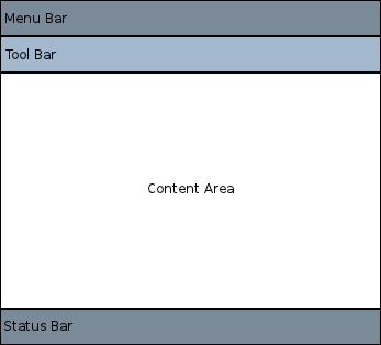
在每个区域内,可以添加和连接不同的控件以形成应用程序。例如,以下代码段是使用先前布局的基本应用程序:
  //import related modules
  import QtQuick 2.3
  import QtQuick.Controls 1.2
  import QtQuick.Window 2.2

  //window containing the application
  ApplicationWindow {

      //title of the application
      title: qsTr("Hello World")
      width: 640
      height: 480

      //menu containing two menu items
      menuBar: MenuBar {
          Menu {
              title: qsTr("File")
              MenuItem {
                  text: qsTr("&Open")
                  onTriggered: console.log("Open action triggered");
              }
              MenuItem {
                  text: qsTr("Exit")
                  onTriggered: Qt.quit();
              }
          }
      }

      //Content Area

      //a button in the middle of the content area
      Button {
          text: qsTr("Hello World")
          anchors.horizontalCenter: parent.horizontalCenter
          anchors.verticalCenter: parent.verticalCenter
      }
  }
该应用程序有两个菜单项和中间的一个按钮。Clicking on the Exit menu item closes the application.
There are also different navigation methods and different controls such as buttons and sliders available. The following examples are available from Qt Creator and demonstrate different controls and layouts.
Feel free to copy and paste the snippets onto this simple Hellow World application to see how QML works.
Handling User Input
One of the great advantages of using QML to define a user interface is that it allows the user interface designer to define how the application should react to events with simple JavaScript expressions. In QML, we refer to those events as signals and these signals are handled by signal handlers.
For example, consider the following example:
  Rectangle {
      width: 200
      height: 100
      color: "red"

      Text {
          anchors.centerIn: parent
          text: "Hello, World!"
      }

      MouseArea {
          anchors.fill: parent
          onClicked: parent.color = "blue"
      }
  }
This example can be saved as "ClickableHelloWorld.qml" and run with qmlscene. Whenever the user clicks anywhere in the window, the rectangle will change from red to blue. Note that the MouseArea type also emits the clicked signal for touch events, so this code will also work on a mobile device.
Keyboard user input can be similarly handled with a simple expression:
  Rectangle {
      width: 200
      height: 100
      color: "red"

      Text {
          anchors.centerIn: parent
          text: "Hello, World!"
      }

      focus: true
      Keys.onPressed: {
          if (event.key == Qt.Key_Return) {
              color = "blue";
              event.accepted = true;
          }
      }
  }
By accepting focus, the color can be changed to blue whenever the return key is pressed.
Property Bindings
Objects and their properties form the basis of a graphical interface defined in a QML document. The QML language allows properties to be bound to each other in various ways, enabling highly dynamic user interfaces.
In the following example, the geometry of each child Rectangle is bound to that of the parent Rectangle. If the geometry of the parent Rectangle were to change, the geometry of each child Rectangle would automatically update due to the property bindings.
  Rectangle {
      width: 400
      height: 200

      Rectangle {
          width: parent.width / 2
          height: parent.height
      }

      Rectangle {
          width: parent.width / 2
          height: parent.height
          x: parent.width / 2
      }
  }
Animations
Properties can also be dynamically updated via animations. The QtQuick import provides various animation types which can be used to animate changes to a property's value. In the following example, a property is animated which then gets displayed in a Text area:
  Rectangle {
      color: "lightgray"
      width: 200
      height: 200

      property int animatedValue: 0
      SequentialAnimation on animatedValue {
          loops: Animation.Infinite
          PropertyAnimation { to: 150; duration: 1000 }
          PropertyAnimation { to: 0; duration: 1000 }
      }

      Text {
          anchors.centerIn: parent
          text: parent.animatedValue
      }
  }
The value being displayed will vary from 0 to 150 periodically.
Defining Custom QML Types for Re-use
One of the most important concepts in QML is that of type re-use. An application will probably have multiple visual types which are all similar (for example, multiple push buttons), and QML allows these sort of things to be defined as re-usable, custom types, to minimize code duplication and maximize readability.
For example, imagine that the developer defines a new Button type in the Button.qml file:
  // Button.qml
  import QtQuick 2.3

  Rectangle {
      width: 100; height: 100
      color: "red"

      MouseArea {
          anchors.fill: parent
          onClicked: console.log("Button clicked!")
      }
  }
That type may now be re-used multiple times in the application, as follows:
// application.qml import QtQuick 2.3 Column { Button { width: 50; height: 50 } Button { x: 50; width: 100; height: 50; color: "blue" } Button { width: 50; height: 50; radius: 8 } } |
|

In this way, modular user interface types are assembled and reused within an application.
See QML Object Attributes for more details on how to develop your own reusable components.
Where to Go from Here
Now that you have seen QML in action, you are ready to take your next step. The follow page will lead you in your journey with QML.