Qml Charts Example
Running the Example
To run the example from Qt Creator, open the Welcome mode and select the example from Examples. For more information, visit Building and Running an Example.
Creating Charts Using QML
Creating each chart type begins with the creation of a ChartView.
To create a pie, we use the PieSeries API together with a few PieSlices:
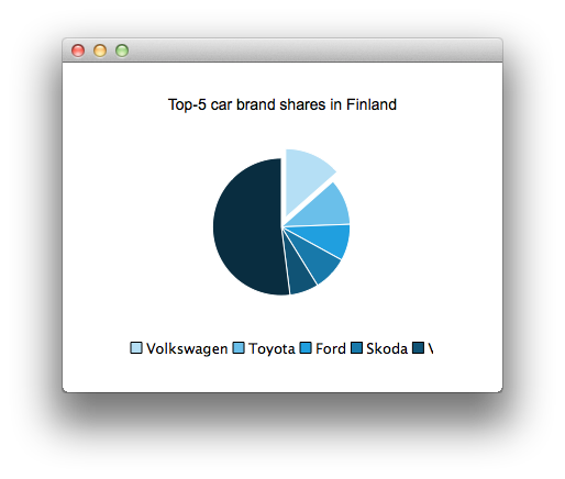
  ChartView {
      id: chart
      title: "Top-5 car brand shares in Finland"
      anchors.fill: parent
      legend.alignment: Qt.AlignBottom
      antialiasing: true

      PieSeries {
          id: pieSeries
          PieSlice { label: "Volkswagen"; value: 13.5 }
          PieSlice { label: "Toyota"; value: 10.9 }
          PieSlice { label: "Ford"; value: 8.6 }
          PieSlice { label: "Skoda"; value: 8.2 }
          PieSlice { label: "Volvo"; value: 6.8 }
      }
  }

  Component.onCompleted: {
      // You can also manipulate slices dynamically
      othersSlice = pieSeries.append("Others", 52.0);
      pieSeries.find("Volkswagen").exploded = true;
  }
To create a chart with a line series:

  ChartView {
      title: "Line"
      anchors.fill: parent
      antialiasing: true

      LineSeries {
          name: "LineSeries"
          XYPoint { x: 0; y: 0 }
          XYPoint { x: 1.1; y: 2.1 }
          XYPoint { x: 1.9; y: 3.3 }
          XYPoint { x: 2.1; y: 2.1 }
          XYPoint { x: 2.9; y: 4.9 }
          XYPoint { x: 3.4; y: 3.0 }
          XYPoint { x: 4.1; y: 3.3 }
      }
  }
And spline series:
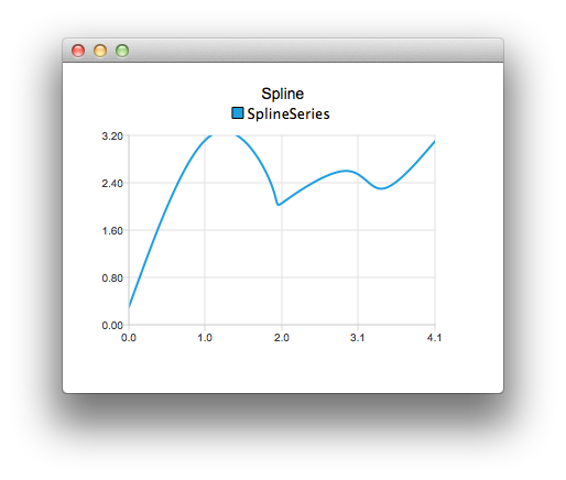
  ChartView {
      title: "Spline"
      anchors.fill: parent
      antialiasing: true

      SplineSeries {
          name: "SplineSeries"
          XYPoint { x: 0; y: 0.0 }
          XYPoint { x: 1.1; y: 3.2 }
          XYPoint { x: 1.9; y: 2.4 }
          XYPoint { x: 2.1; y: 2.1 }
          XYPoint { x: 2.9; y: 2.6 }
          XYPoint { x: 3.4; y: 2.3 }
          XYPoint { x: 4.1; y: 3.1 }
      }
  }
Then we create a chart that illustrates the NHL All-Star player selections by using three area series:
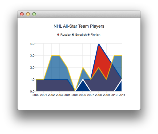
  ChartView {
      title: "NHL All-Star Team Players"
      anchors.fill: parent
      antialiasing: true

      ValueAxis {
          id: valueAxis
          min: 2000
          max: 2011
          tickCount: 12
          labelFormat: "%.0f"
      }

      AreaSeries {
          name: "Russian"
          color: "#FFD52B1E"
          borderColor: "#FF0039A5"
          borderWidth: 3
          axisX: valueAxis
          upperSeries: LineSeries {
              XYPoint { x: 2000; y: 1 }
              XYPoint { x: 2001; y: 1 }
              XYPoint { x: 2002; y: 1 }
              XYPoint { x: 2003; y: 1 }
              XYPoint { x: 2004; y: 1 }
              XYPoint { x: 2005; y: 0 }
              XYPoint { x: 2006; y: 1 }
              XYPoint { x: 2007; y: 1 }
              XYPoint { x: 2008; y: 4 }
              XYPoint { x: 2009; y: 3 }
              XYPoint { x: 2010; y: 2 }
              XYPoint { x: 2011; y: 1 }
          }
      }
      ...
Then a couple of scatter series:

  ChartView {
      title: "Scatters"
      anchors.fill: parent
      antialiasing: true

      ScatterSeries {
          id: scatter1
          name: "Scatter1"
          XYPoint { x: 1.5; y: 1.5 }
          XYPoint { x: 1.5; y: 1.6 }
          XYPoint { x: 1.57; y: 1.55 }
          XYPoint { x: 1.8; y: 1.8 }
          XYPoint { x: 1.9; y: 1.6 }
          XYPoint { x: 2.1; y: 1.3 }
          XYPoint { x: 2.5; y: 2.1 }
      }

      ScatterSeries {
          name: "Scatter2"
      ...
And a few different bar series:
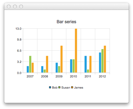
  ChartView {
      title: "Bar series"
      anchors.fill: parent
      legend.alignment: Qt.AlignBottom
      antialiasing: true

      BarSeries {
          id: mySeries
          axisX: BarCategoryAxis { categories: ["2007", "2008", "2009", "2010", "2011", "2012" ] }
          BarSet { label: "Bob"; values: [2, 2, 3, 4, 5, 6] }
          BarSet { label: "Susan"; values: [5, 1, 2, 4, 1, 7] }
          BarSet { label: "James"; values: [3, 5, 8, 13, 5, 8] }
      }
  }

  ChartView {
      title: "Stacked Bar series"
      anchors.fill: parent
      legend.alignment: Qt.AlignBottom
      antialiasing: true

      StackedBarSeries {
          id: mySeries
          axisX: BarCategoryAxis { categories: ["2007", "2008", "2009", "2010", "2011", "2012" ] }
          BarSet { label: "Bob"; values: [2, 2, 3, 4, 5, 6] }
          BarSet { label: "Susan"; values: [5, 1, 2, 4, 1, 7] }
          BarSet { label: "James"; values: [3, 5, 8, 13, 5, 8] }
      }
  }

  ChartView {
      title: "Percent Bar series"
      anchors.fill: parent
      legend.alignment: Qt.AlignBottom
      antialiasing: true

      PercentBarSeries {
          axisX: BarCategoryAxis { categories: ["2007", "2008", "2009", "2010", "2011", "2012" ] }
          BarSet { label: "Bob"; values: [2, 2, 3, 4, 5, 6] }
          BarSet { label: "Susan"; values: [5, 1, 2, 4, 1, 7] }
          BarSet { label: "James"; values: [3, 5, 8, 13, 5, 8] }
      }
  }

  ChartView {
      title: "Horizontal Bar series"
      anchors.fill: parent
      legend.alignment: Qt.AlignBottom
      antialiasing: true

      HorizontalBarSeries {
          axisY: BarCategoryAxis { categories: ["2007", "2008", "2009", "2010", "2011", "2012" ] }
          BarSet { label: "Bob"; values: [2, 2, 3, 4, 5, 6] }
          BarSet { label: "Susan"; values: [5, 1, 2, 4, 1, 7] }
          BarSet { label: "James"; values: [3, 5, 8, 13, 5, 8] }
      }
  }

  ChartView {
      title: "Horizontal Stacked Bar series"
      anchors.fill: parent
      legend.alignment: Qt.AlignBottom
      antialiasing: true

      HorizontalStackedBarSeries {
          axisY: BarCategoryAxis { categories: ["2007", "2008", "2009", "2010", "2011", "2012" ] }
          BarSet { label: "Bob"; values: [2, 2, 3, 4, 5, 6] }
          BarSet { label: "Susan"; values: [5, 1, 2, 4, 1, 7] }
          BarSet { label: "James"; values: [3, 5, 8, 13, 5, 8] }
      }
  }
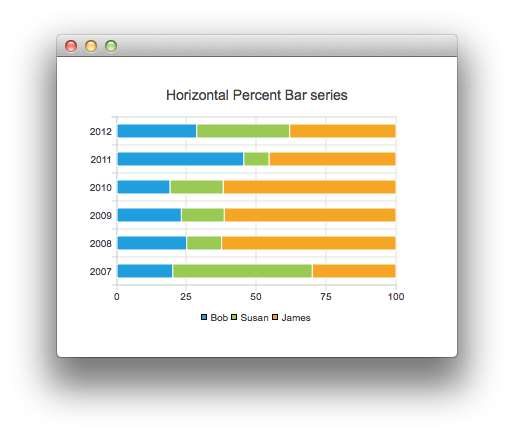
  ChartView {
      title: "Horizontal Percent Bar series"
      anchors.fill: parent
      legend.alignment: Qt.AlignBottom
      antialiasing: true

      HorizontalPercentBarSeries {
          axisY: BarCategoryAxis { categories: ["2007", "2008", "2009", "2010", "2011", "2012" ] }
          BarSet { label: "Bob"; values: [2, 2, 3, 4, 5, 6] }
          BarSet { label: "Susan"; values: [5, 1, 2, 4, 1, 7] }
          BarSet { label: "James"; values: [3, 5, 8, 13, 5, 8] }
      }
  }
And finally an example demonstrating how to create a donut chart with two pie series:
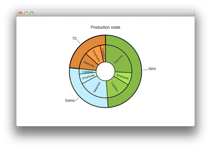
  ChartView {
      id: chart
      title: "Production costs"
      anchors.fill: parent
      legend.visible: false
      antialiasing: true

      PieSeries {
          id: pieOuter
          size: 0.96
          holeSize: 0.7
          PieSlice { id: slice; label: "Alpha"; value: 19511; color: "#8AB846"; borderColor: "#163430" }
          PieSlice { label: "Epsilon"; value: 11105; color: "#C0EEFF"; borderColor: "#3B391C" }
          PieSlice { label: "Psi"; value: 9352; color: "#DF8939"; borderColor: "#13060C" }
      }

      PieSeries {
          size: 0.7
          id: pieInner
          holeSize: 0.25

          PieSlice { label: "Materials"; value: 10334; color: "#8AB846"; borderColor: "#163430" }
          PieSlice { label: "Employee"; value: 3066; color: "#AAE356"; borderColor: "#163430" }
          PieSlice { label: "Logistics"; value: 6111; color: "#99CC4E"; borderColor: "#163430" }

          PieSlice { label: "Materials"; value: 7371; color: "#C0EEFF"; borderColor: "#3B391C" }
          PieSlice { label: "Employee"; value: 2443; color: "#C9FAFF"; borderColor: "#3B391C" }
          PieSlice { label: "Logistics"; value: 1291; color: "#B0FAFF"; borderColor: "#3B391C" }

          PieSlice { label: "Materials"; value: 4022; color: "#DF8939"; borderColor: "#13060C" }
          PieSlice { label: "Employee"; value: 3998; color: "#FC9D42"; borderColor: "#13060C" }
          PieSlice { label: "Logistics"; value: 1332; color: "#F2963F"; borderColor: "#13060C" }
      }
  }

  Component.onCompleted: {
      // Set the common slice properties dynamically for convenience
      for (var i = 0; i < pieOuter.count; i++) {
          pieOuter.at(i).labelPosition = PieSlice.LabelOutside;
          pieOuter.at(i).labelVisible = true;
          pieOuter.at(i).borderWidth = 3;
      }
      for (var i = 0; i < pieInner.count; i++) {
          pieInner.at(i).labelPosition = PieSlice.LabelInsideNormal;
          pieInner.at(i).labelVisible = true;
          pieInner.at(i).borderWidth = 2;
      }
  }
Additionally, antialiasing is set with the qml property in Qt Quick 2.
Files:
- qmlchart/qml/qmlchart/View1.qml
- qmlchart/qml/qmlchart/View10.qml
- qmlchart/qml/qmlchart/View11.qml
- qmlchart/qml/qmlchart/View12.qml
- qmlchart/qml/qmlchart/View2.qml
- qmlchart/qml/qmlchart/View3.qml
- qmlchart/qml/qmlchart/View4.qml
- qmlchart/qml/qmlchart/View5.qml
- qmlchart/qml/qmlchart/View6.qml
- qmlchart/qml/qmlchart/View7.qml
- qmlchart/qml/qmlchart/View8.qml
- qmlchart/qml/qmlchart/View9.qml
- qmlchart/qml/qmlchart/main.qml
- qmlchart/main.cpp
- qmlchart/qmlchart.pro
- qmlchart/resources.qrc